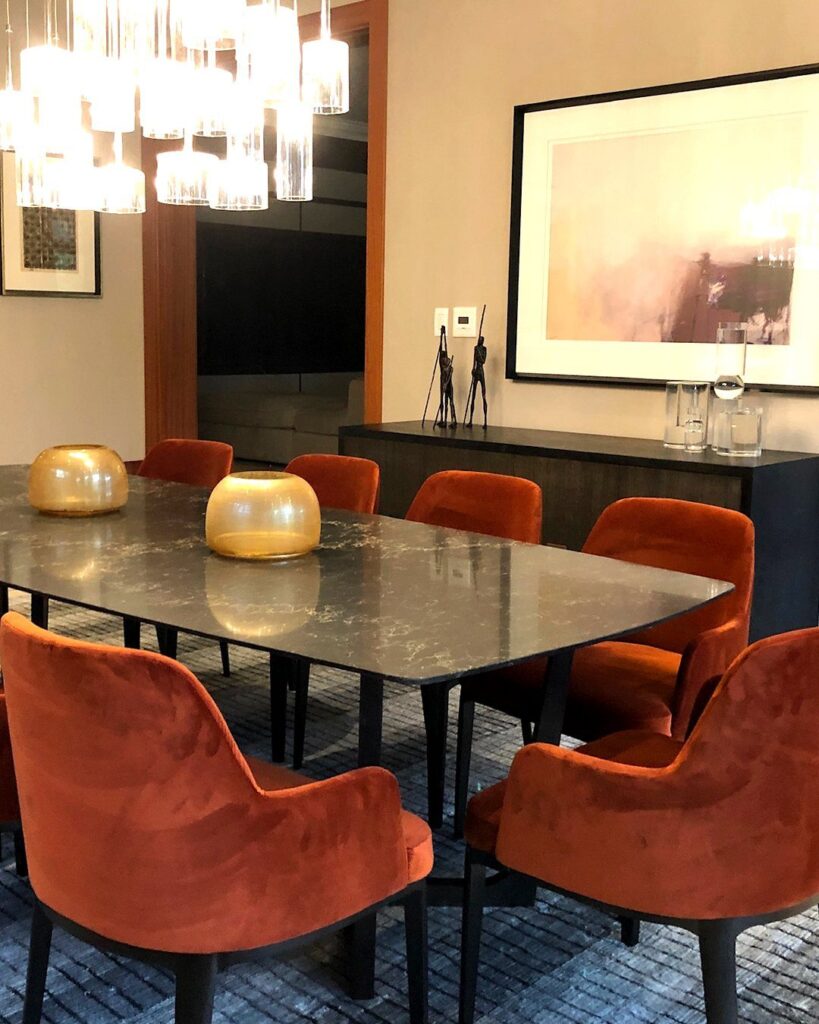
Light decides which of these warm colors is yours: a dining room used mostly at breakfast suits Warm Yellows, while one used mostly at night can carry a Burgundy Dining Room or Cocoa Brown.
The list runs from pale petal pink and cream to deep, dark walls, and the easiest way to choose is a sample patch checked at midday and again after dark with your dining lights on.
1. Warm Yellows

Yellow on the walls does the work of a sunny window, which is why it suits a dining room that mostly gets used for breakfast and weekend lunches.
White cane chairs and a white table keep it from tipping into too much color, and I like that the yellow stays warm instead of lemony.
Paint a sample patch and check it morning and evening before buying a gallon.
2. Terracotta Dining Room
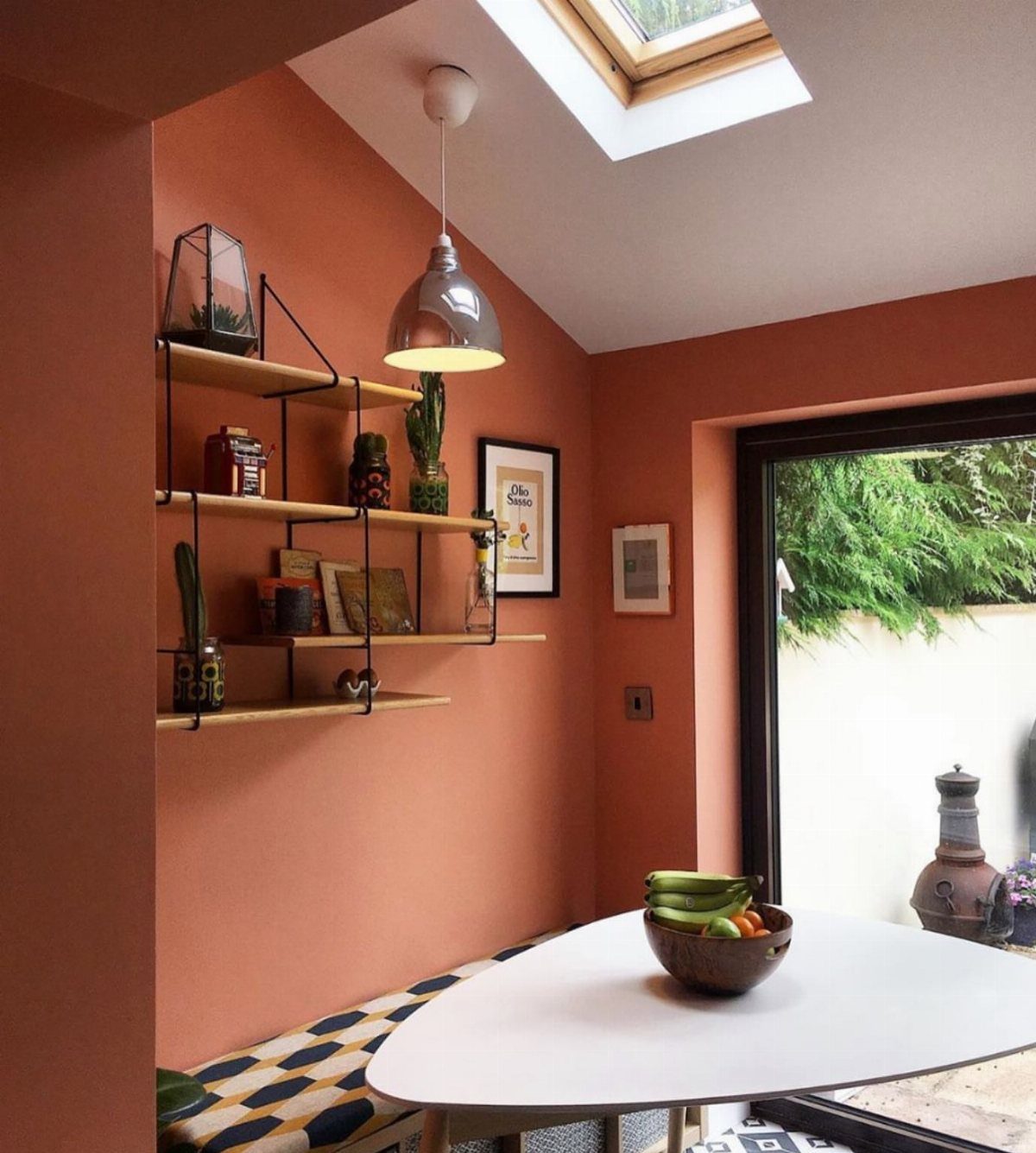
Earth tones are replacing cool grays in dining rooms, and terracotta is the boldest version of that shift, alongside taupes, khakis and mushroom shades. In a small nook, painting it on every wall feels cozy rather than closed in.
A white table and light open shelving keep the clay color from getting heavy. A patterned bench adds a second layer for very little money.
If terracotta feels like a big leap, try taupe or mushroom first. Same direction, quieter result.
3. Warm Neutrals
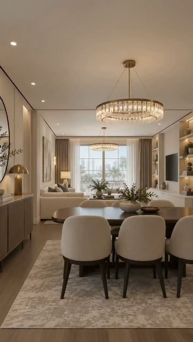
Cream and beige walls give a dining room a calm base that rarely feels dated, so the room reads cozy without announcing a color. Warm neutrals suit renters and first-time owners who expect to change the furniture before the paint.
My advice: let texture do what color won’t. Beige upholstered chairs, linen curtains and a dark wood table add contrast, and gold lighting adds a little glow.
Hold paint swatches next to your curtains, since cream with a yellow undertone and one with a pink undertone can clash.
4. Burgundy Dining Room
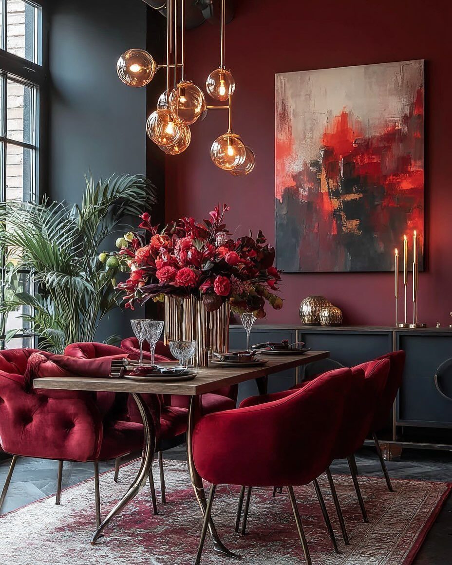
Burgundy is the choice for a dining room used mostly in the evening, when walls this deep turn dinner into an occasion.
Velvet chairs in a similar red make the room feel layered, and gold lighting keeps the dark walls from going flat.
Plan on at least 2 coats, and expect a weekend for a typical room.
Large art matters here; a big abstract piece gives the eye somewhere to rest. I would skip burgundy in a room with one small window.
5. Burnt Orange
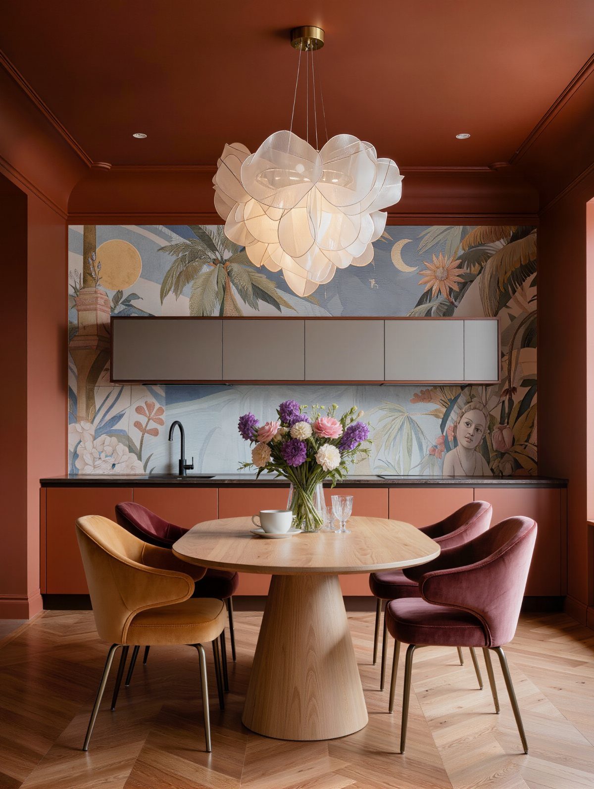
Burnt orange is a muted orange, so it adds warmth without the glare of a true citrus shade. A round wooden table suits it well, since the wood and the paint share the same warm base.
Colorful velvet chairs are an easy way to bring in more tones, and swapping chair covers costs far less than repainting. Keep the light fixture white or pale so the orange stays the star.
I would paint just the wall behind the table first. It shows whether you like living with the color.
6. Cocoa Brown
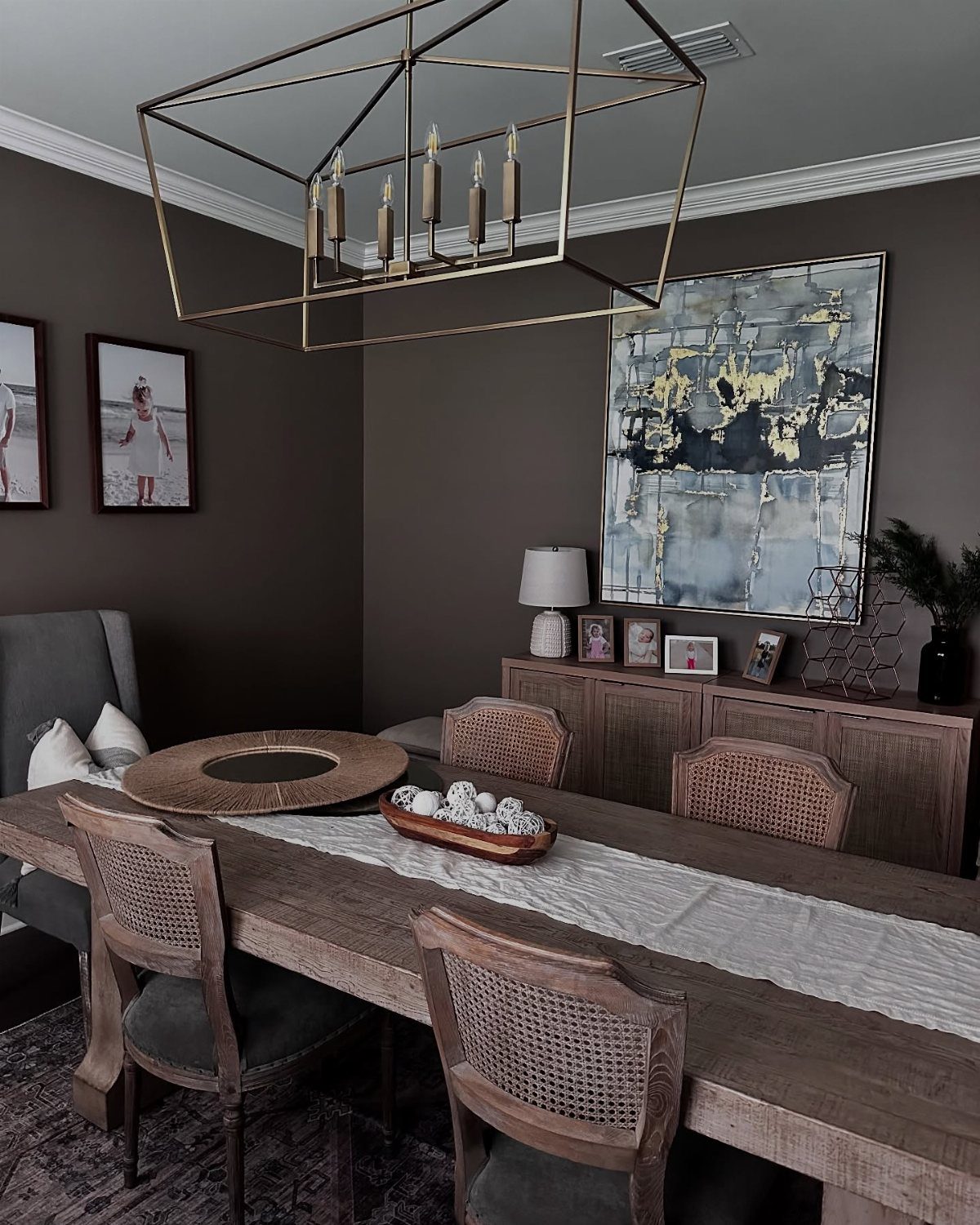
Cocoa brown walls are a bolder move than most people expect, and they can be exciting rather than gloomy. Paired with a wooden table and sideboard, the whole room reads as one warm, enveloping space.
Gold lighting is what keeps brown from feeling heavy, so spend on the chandelier before the chairs. Cane-back chairs add a lighter texture against the dark paint.
A large abstract painting works well here because the wall is the backdrop, not the decoration.
7. Sage Dining Room
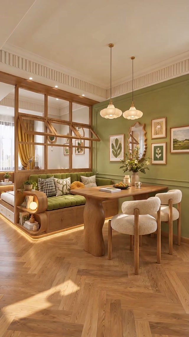
Sage is a green that behaves like a neutral, which is why a built-in banquette painted to match the wall looks intentional rather than themed.
Sage green reads cool on its own, so wood has to carry the warmth: a curved table in honey or walnut and a herringbone floor in a similar tone will do it.
White chairs keep the corner light, and they are the easiest piece to swap later if you tire of them.
I would choose sage over a brighter green for a first paint project, since it settles into the room instead of competing with it.
8. Petal Pink
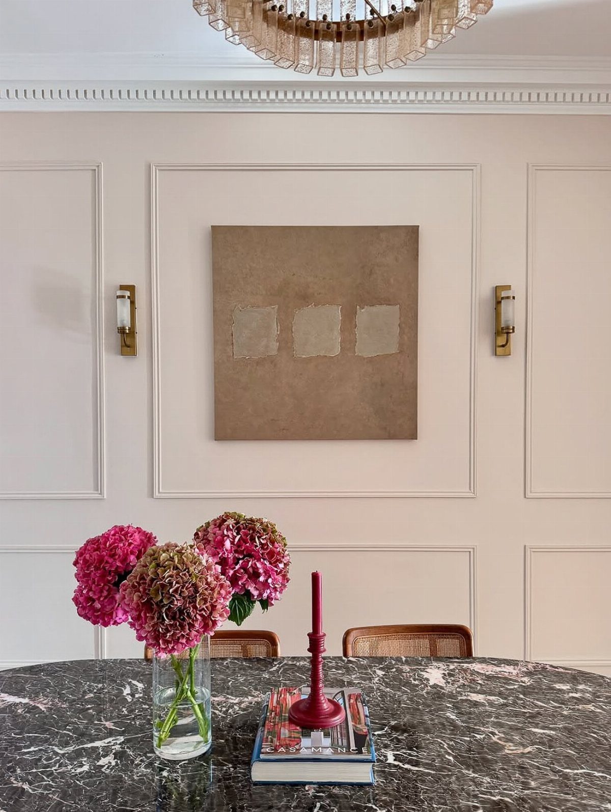
Petal pink is a surprising dining room color, and I like it because it reads as a soft, warm glow rather than a statement. A marble table cools the sweetness a little, so the room feels grown-up instead of sugary.
Pink hydrangeas on the table repeat the wall without matching it.
A pale pink wall needs something dark to keep it from floating, so hang one large brown or deep-toned piece and add a single red accent like a taper candle.
Keep the pink pale and the accents few. A small sample patch will show whether the shade leans peach or lilac in your light.
Impact of Lighting
Paint changes with the light that hits it, so test a color in the room where it will live. Natural light shows a shade closest to its true self, while lamps and bulbs push it warmer, yellower or flatter.
Look at your sample patch at midday, then again after dark with the dining lights on. If you eat most meals at night, trust the evening look over the daytime one.
Bulbs matter as much as the paint. Swapping a bulb for a different warmth can shift a wall’s color, so settle on your bulbs before you commit to a gallon.
Color Psychology
Color affects appetite and mood, and a dining room is one of the few rooms where that is the whole job. Reds, oranges and yellows tend to stimulate appetite and conversation, which suits a table where people linger.
Cool colors like blue and green lean calming. That makes them a good choice if you want the room to feel relaxed more than lively.
You can mix the two. Put a warm color on the walls and bring in a cool one through chairs, a runner or tableware, and the room keeps its energy without turning restless.
Vibrant oranges, cozy reds, and sunny yellows infuse spaces with energy and warmth, two things that are always good to have in a room, no matter the season.
Room Size Considerations
Room size should guide how much color you commit to.
In a small dining room, light, muted shades make the walls feel farther away. A larger room can take bolder, deeper color, which adds depth.
Dining rooms also tolerate drama better than most rooms, since you sit in them for a meal rather than all day. You can go darker than you would in a bedroom or office without tiring of it.
Evening helps too. Under candles, a dimmer or a pendant, rich shades glow instead of feeling heavy, so a color that looks intense at noon may look right at 7 PM.
Frequently Asked Questions
What are some good warm paint colors for a dining room?
Warm yellow, terracotta, burnt orange, burgundy, cocoa brown and cream or beige all work.
Morning light is kind to yellow, so it suits a table that sees breakfast and weekend lunches. If dinner is the only meal you eat there, a deep burgundy will feel better.
What colors make a room feel warm and cozy?
For the strongest sense of warmth, go with red, orange or yellow; cream and beige give a cozy feel too, without announcing a color.
Terracotta can feel snug rather than closed in, even painted on every wall of a small nook. Gold lighting adds a glow, and it keeps darker shades like brown or burgundy from going flat.