The colors here run from pale yellow, apricot and off-white with ornate molding to navy, olive, dark brown and high-gloss finishes, and the paint is cheap while the prep is where the effort sits.
What decides your pick is the furniture and light you already have: a dark wood table, the metal in your fixtures, and how much daylight the room gets all push a color one way or the other.
A bright room can carry a deep shade, a dim one usually wants something lighter, and the teal dining room shows how far a full commitment can go.
1. Warm and Welcoming Colors
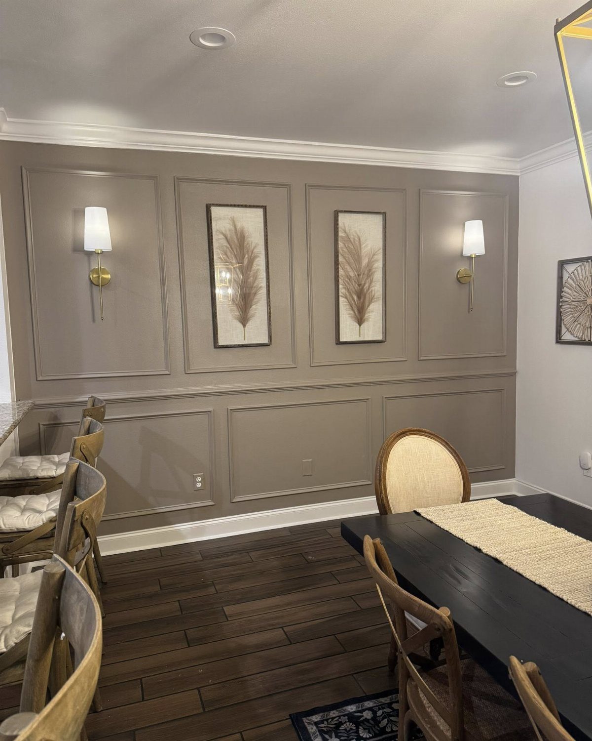
Taupe is the warm neutral I would pick for a dining room that needs to feel settled without turning dark. Paneled walls like these carry it well, because the color sits flat and calm behind a dark wood table.
A runner on the table does the same job in fabric.
Painting wainscoting is a weekend project, and one color across the whole wall keeps it simple.
2. Deep Navy Dining Room
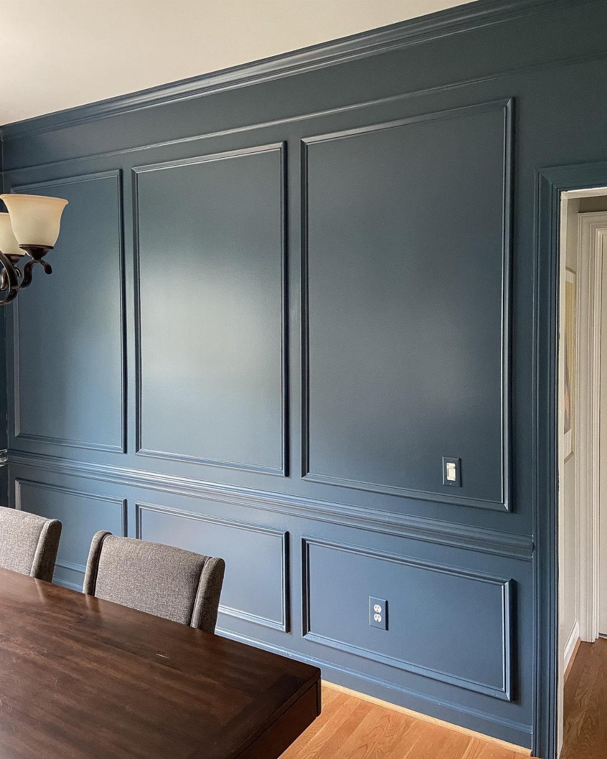
Navy on every wall, picture frame molding included, is a bold move that still reads traditional. Painting the molding the same shade keeps the room quiet and lets the texture do the talking.
Dark wood and grey upholstery sit comfortably against it. A sconce gives the walls a glow at night, and I like that better than relying on an overhead light alone.
If you rent, check your lease before committing to a color this deep.
Designer Richard Keith Langham intentionally veered away from a neutral palette throughout this New Orleans townhouse, instead drenching the walls in saturated jewel tones—like the peacock dining room—as a way to highlight his client’s art collections.
— Veranda
3. Bold and Dramatic Colors
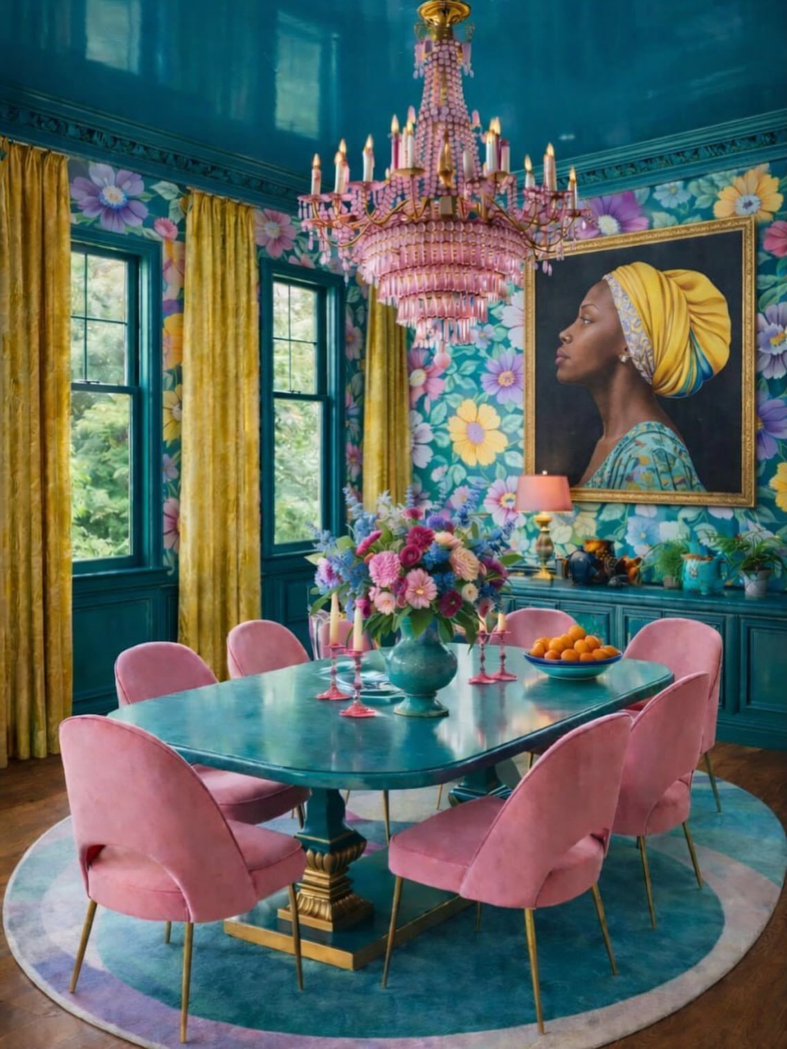
Teal on the walls and the ceiling, then pink in the chairs and chandelier: that pairing is the loudest way to answer the question of dining room color.
Floral wallpaper and a portrait pile on more, and it works because every piece stays inside those 2 hues.
On a budget, I would pick one pink item first, such as chair seats or a lamp shade, and see how you feel living with it.
Wrapping the ceiling in the wall color closes the space in and makes it cozy, which is exactly what a dark dining room wants.
4. Neutral Colors
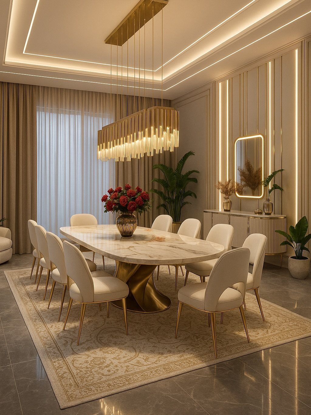
Beige walls and matching curtains give a dining room a calm backdrop, and that leaves the table and chandelier to be the show. A white marble table, white chairs and gold accents all read clearly against it.
This is the easiest palette to change later, since new accents swap in without repainting.
I would keep the walls warm rather than stark, because a warm beige makes gold look richer.
5. Testing Paint Colors
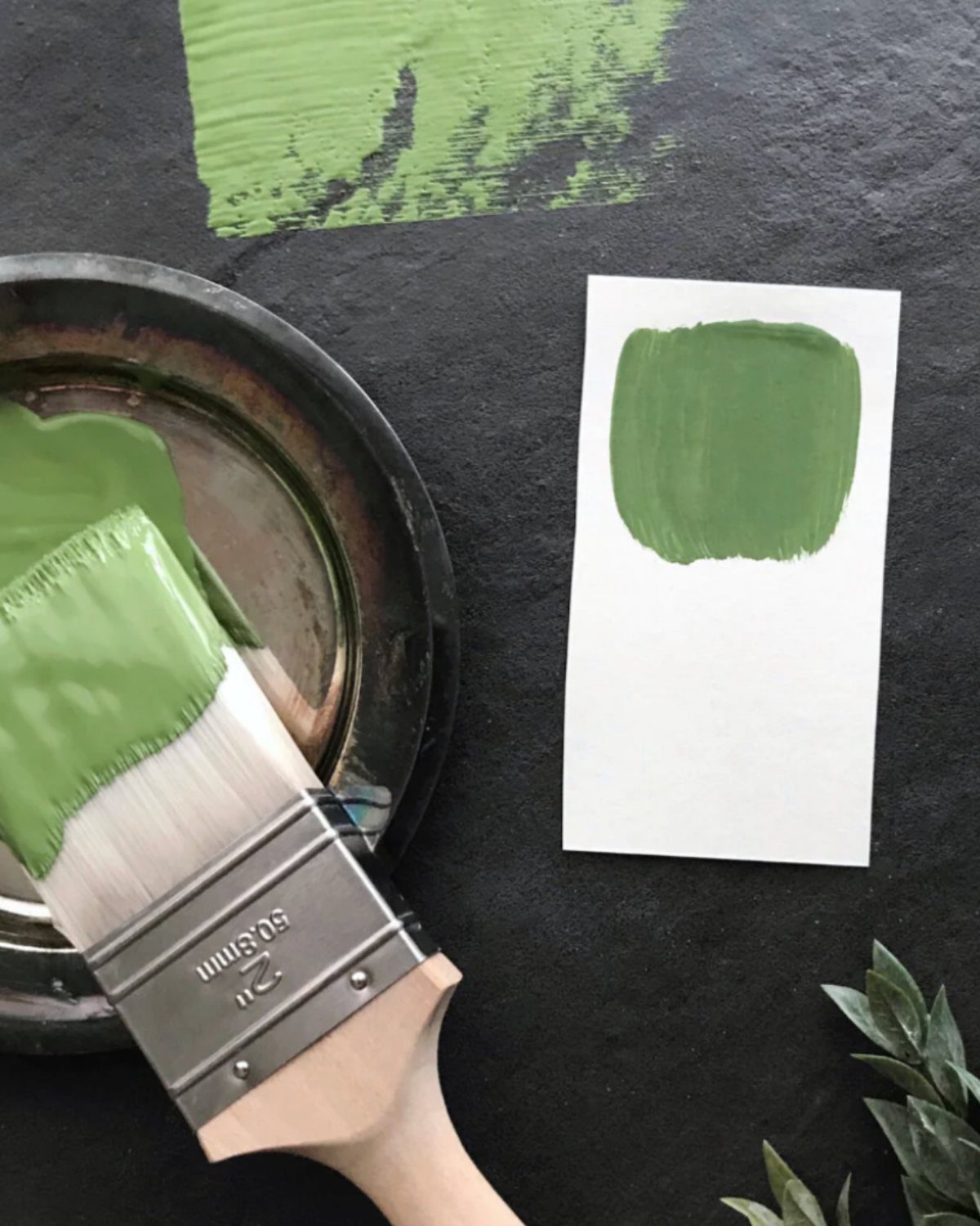
Paint a sample before you buy gallons. A swatch on white paper reads differently than the same green on a dark surface, and both shift again once they sit next to your own walls, so test on the wall itself.
Brush a large patch, or paint a board you can move around the room. Check it in morning light and again at night under your own bulbs.
A sample pot costs a fraction of a gallon, and it can save you a repaint.
6. High-Gloss Colors
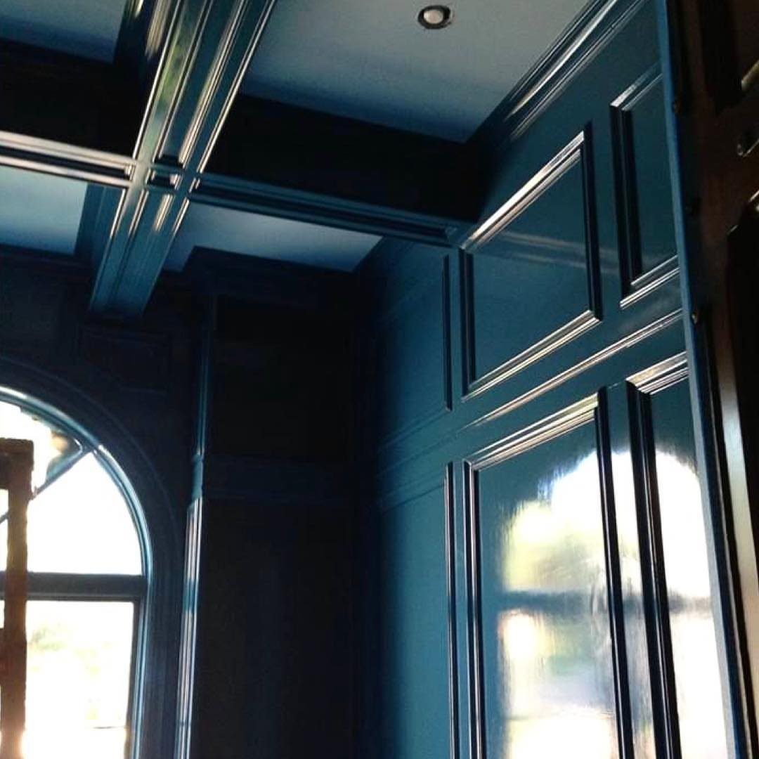
Gloss turns deep blue from a flat wall color into a surface that catches light and bounces it around the room.
On paneled walls and ceiling beams it picks out every groove, which is why the finish suits woodwork far better than a flat plaster wall.
Gloss shows every flaw underneath, so patch, sand, and prime the wall before the first coat goes on. Sand and fill the panels first, and expect to spend more time prepping than painting.
If a whole room feels like too much, try gloss on the beams or the trim alone.
7. Apricot
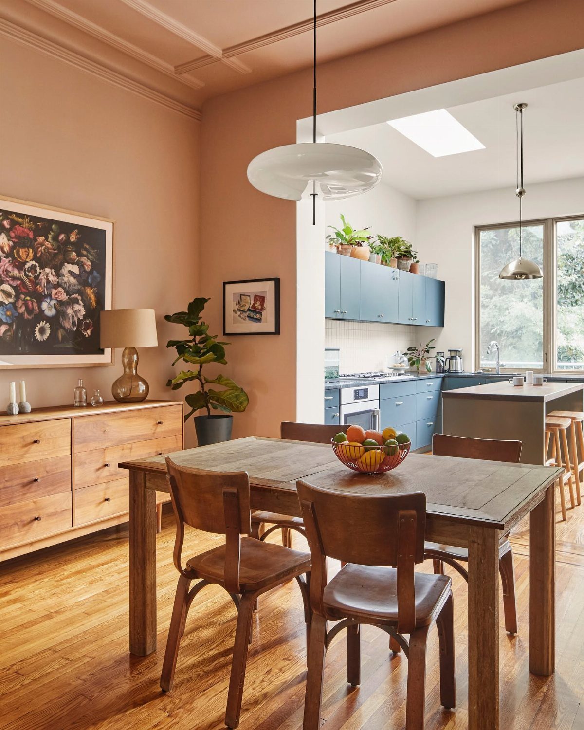
Apricot is a warm, subdued orange, and it holds up next to blue cabinets because the two sit opposite each other on the color wheel. Wood furniture slides in easily on top of it.
I would carry the apricot through the whole dining area rather than one accent wall, so the room reads as a single glowing space. Check the sample against your cabinet color before you commit.
8. Olive Green Walls
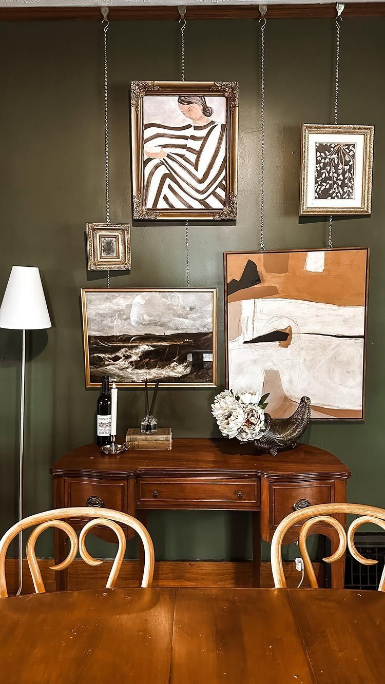
Olive green is a quiet, earthy choice, and it suits wood furniture better than most colors I can name. A wood table and a single white lamp stand out clearly against it.
Frames hung from chains are a cheap way to add height without more wall paint.
The maker of this room says it is still a work in progress after only 2 weeks in the home, and I think that is the right pace: paint first, then add art slowly.
9. Dark Brown Walls
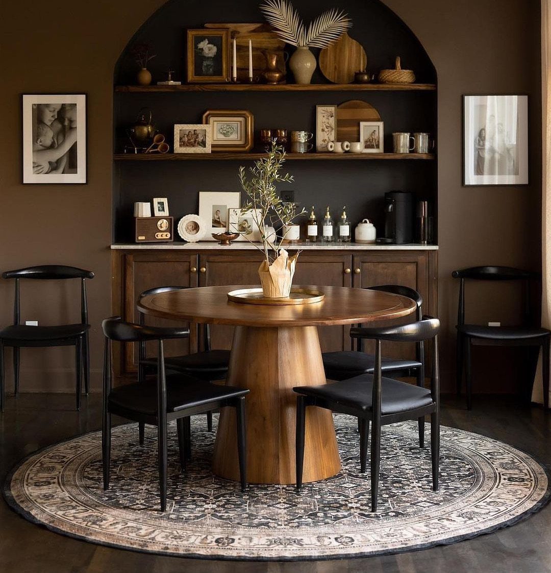
Dark brown walls wrap a dining room like a cocoon, and a round wooden table keeps the mood soft instead of heavy.
An arched alcove gains the most from the color, since decor inside it stands out against the deep shade.
Black chairs fit this palette well. A circular rug repeats the table shape, which I like.
If your room has no alcove, paint a shelf back or one wall in brown and see how you feel about it.
10. Pale Yellow Dining Room
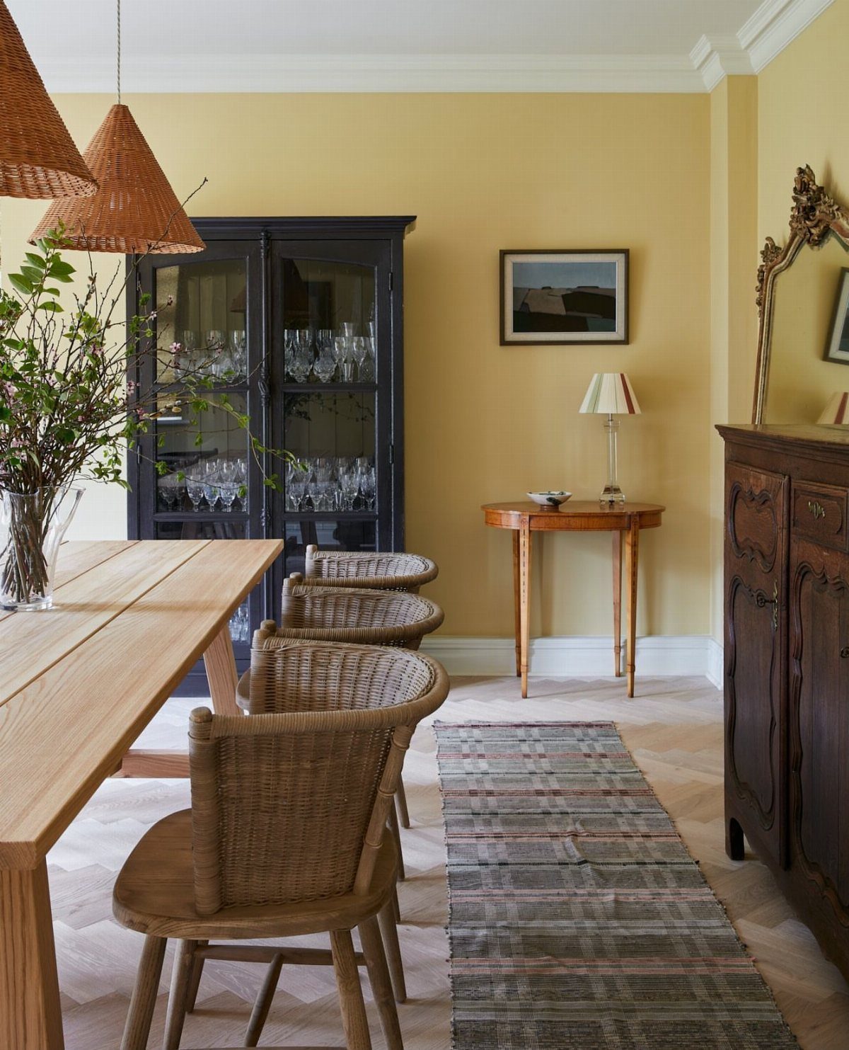
Pale yellow lightens a dining room without the starkness of white, and it is friendly to light wood and woven chairs. A dark blue cabinet gives the soft walls something to push against.
I would keep the rug patterned, because a plain one can leave a yellow room looking washed out. Test the shade on your wall first, since pale yellows can lean either buttery or green depending on the light.
11. Teal Blue Dining Room
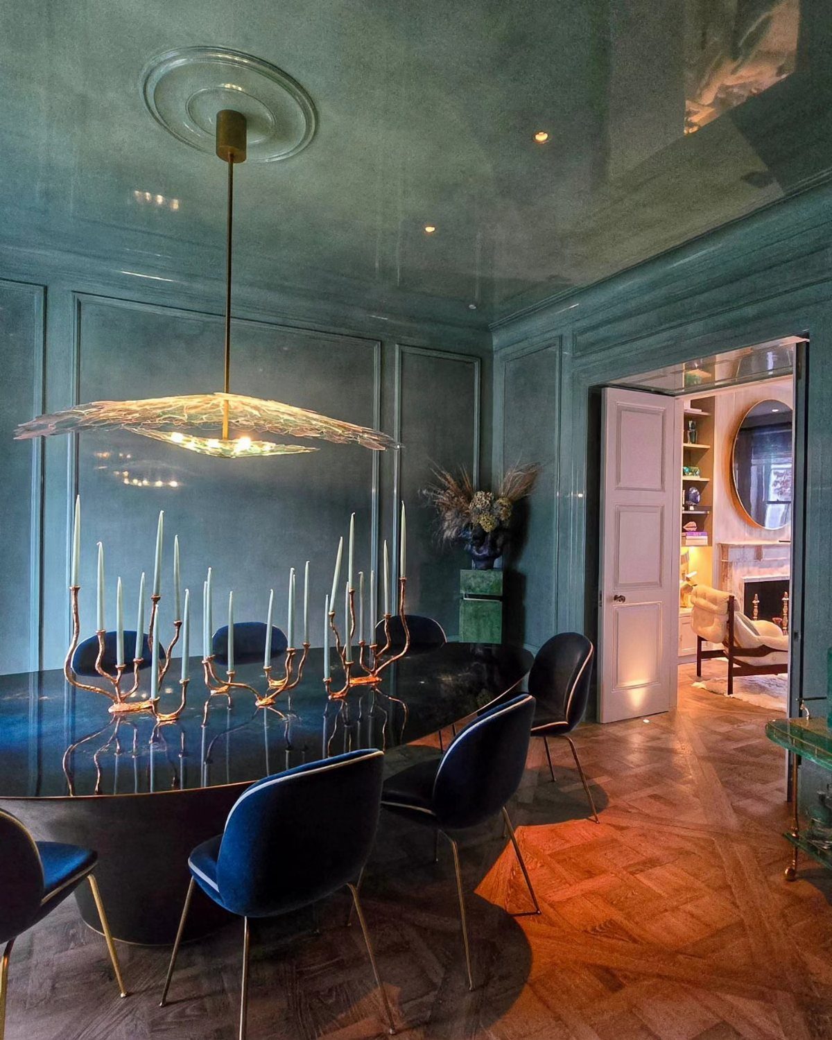
Teal on both walls and ceiling makes a dining room feel like a jewel box, especially with dark blue velvet chairs and a black oval table.
Those 3 deep tones sit close together, so the room feels rich instead of busy.
A gold candelabra is the right metal here, since gold warms the cool teal. If painting the ceiling feels like too much work, I would start with the walls alone and keep the ceiling white.
12. Off-White with Ornate Molding
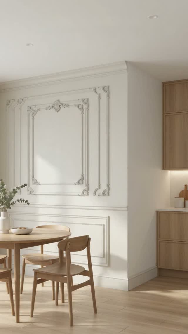
Off-white walls with decorative molding give a dining area an airy, finished look, and the molding does the decorating for you. Light wood furniture and kitchen cabinets keep the whole space bright and consistent.
I would paint the molding the same off-white as the walls so the shadows create the detail. Choose a warm off-white over a stark one, because it sits more comfortably beside wood tones.
Consider Existing Furniture
Begin with the largest pieces in the room, meaning the table and chairs that are already sitting there.
A dark wood table reads crisper against a pale wall, and a saturated wall color turns that same table into the dramatic part of the room.
Look at your metals too. Brass or gold in a light fixture or frames reads differently depending on the paint behind it: a dark wall makes metallic tones pop, and a light one gives a softer look.
Tape up a sample patch, then hold a chair seat or a framed print next to it first; paint looks different beside real objects than it does on a chip.
Lighting Considerations
Look at how much daylight the room gets.
A bright room can handle a darker color, since the sun balances the depth. A dim room usually does better with lighter shades, or the walls can feel gloomy.
Most dinners happen in the evening, so judge the color under your lamps.
Warm bulbs make colors feel cozier. Cool bulbs make cool colors look sharper and warm colors look muted.
When the dining area spills into a bigger open room, a contrasting paint color or a patterned wallpaper marks its edges so the table doesn’t drift.
Color Combinations
Pair your main color with an unexpected second shade, then add clean white accents such as dishes, candles, or a vase. That mix gives the room interest and still lets it handle both a weekend breakfast and a late drink.
Let your home’s style guide how bold you go.
In a modern home, I lean toward neutral walls with one or two bold accents. A traditional one looks good with earthy tones and classic shades like cream or burgundy.
Minimalist rooms do well with soft neutrals or one color in several depths. An eclectic room can handle stronger colors set against each other.
Frequently Asked Questions
What are some neutral colors that would look good in a dining room?
Warm beige, taupe, off-white and soft greys all work, and I lean toward the warm versions. A warm beige makes gold accents look richer, and a warm off-white sits better beside wood than a stark white does.
Which color is best for a dining table?
Dark wood is the safest pick, because it reads crisply against a pale wall and turns dramatic against a saturated one.
A white marble table also stands out clearly against beige walls, and a black oval table looks rich beside deep teal. Choose the table color by looking at the wall behind it, since that pairing decides how it reads.
What are some good color ideas for a dining room in 2026?
Deep, saturated shades are the strongest options: navy, teal, olive green and dark brown all give a dining room real depth.
For something softer, taupe, pale yellow and warm off-white keep the room calm. Whatever you pick, test a sample on your own wall and check it in daylight and under your evening bulbs before buying gallons.
How can I decorate my dining room table?
A runner is the place to start, since it brings in color and texture through fabric and leaves plenty of room for plates and glasses.
A candelabra in a metal that suits the walls, like gold against teal, adds height and warmth.