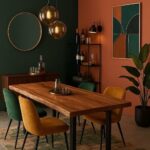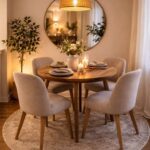
The ideas here run from a peel-and-stick textured wallpaper a renter can hang in a weekend to geometric panels, reclaimed wood and a mirror wall that call for real cutting, measuring and a bigger budget.
What picks the right one is the wall itself: a solid stretch behind the table, free of doorways and windows, in a room whose ceiling height and light suit the finish.
Even a modest wall can carry a 60-30-10 color split, with 60% main color, 30% secondary and 10% accent, so a single painted wall is a fair place to start.
1. Textured Wallpaper
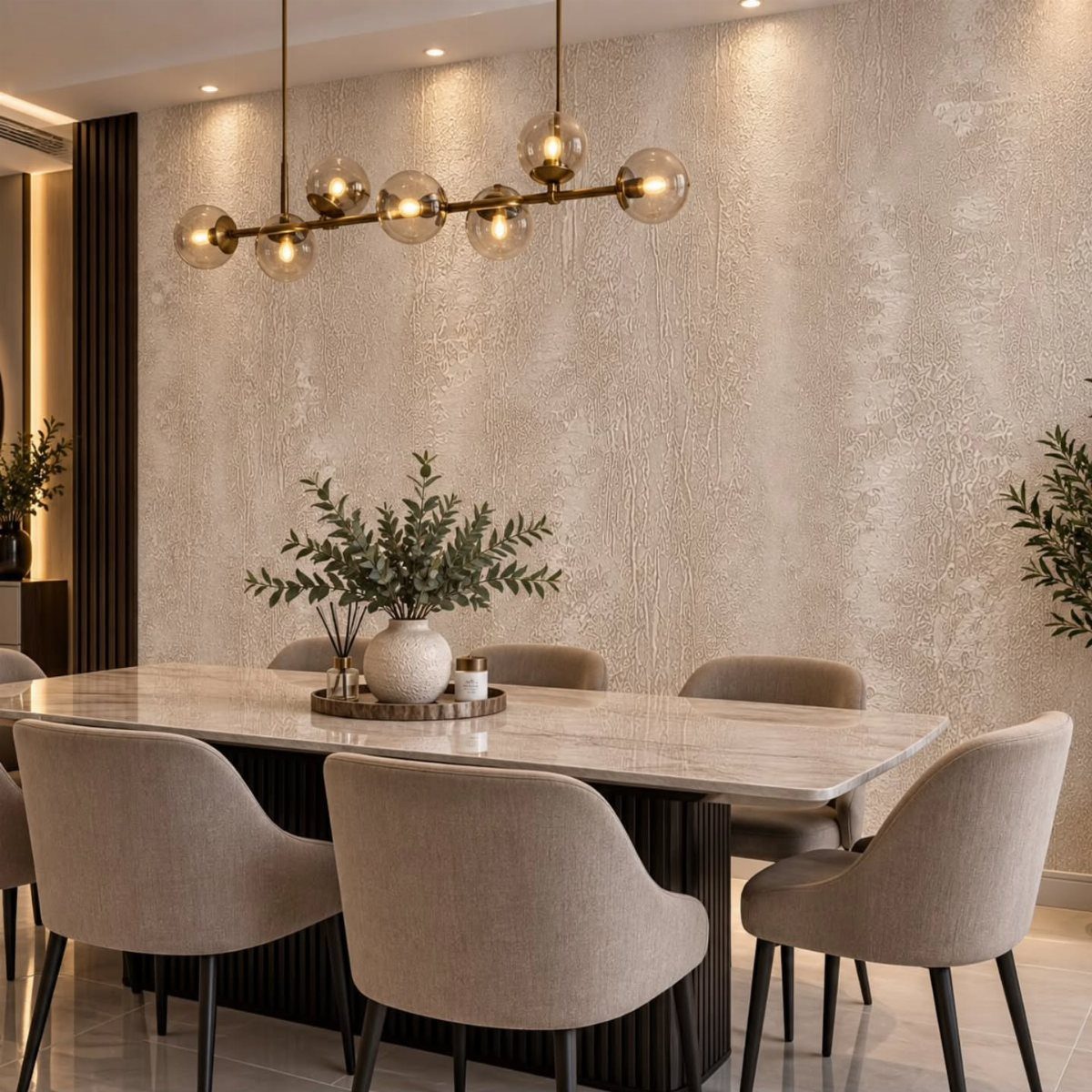
Textured wallpaper is the easiest way to give a flat dining wall some depth without touching plaster or tools. A beige or other soft neutral keeps the texture quiet, so the wall adds interest without competing with the table.
It also hides small wall flaws, since a raised pattern breaks up light that would otherwise catch every dent.
Peel-and-stick versions suit renters on a weekend timeline. Hang it on the wall behind the table, and keep the other walls plain.
2. Wall Mural
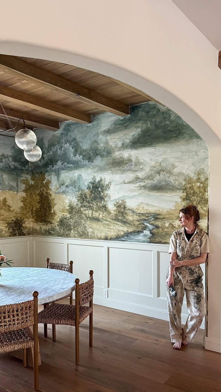
A mural turns one dining wall into a scene, and a landscape is the calmest choice because the eye reads it as distance. Pick one that suits the room’s mood, and let the furniture stay simple.
For a budget and a weekend, a printed mural in panels is the realistic route.
Painting one freehand takes far more time and skill than most first projects allow. Whichever you pick, give it the wall behind the table so everyone seated faces it.
3. Geometric Panels
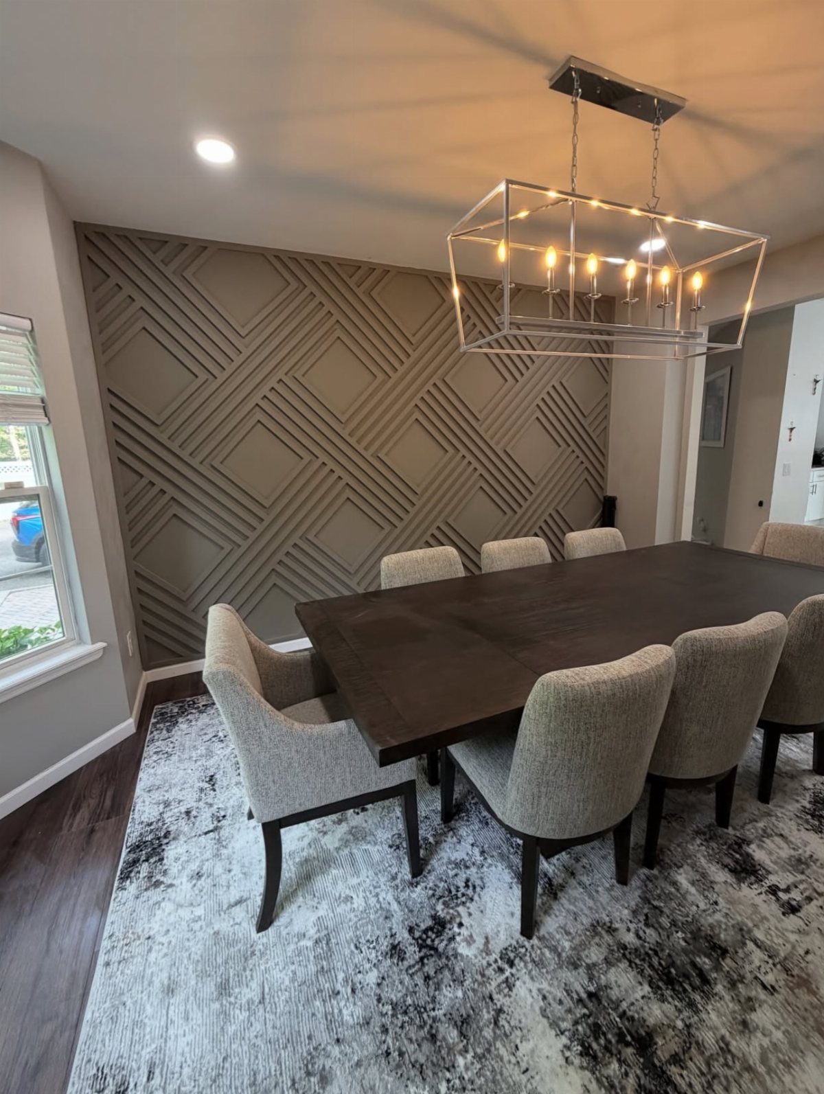
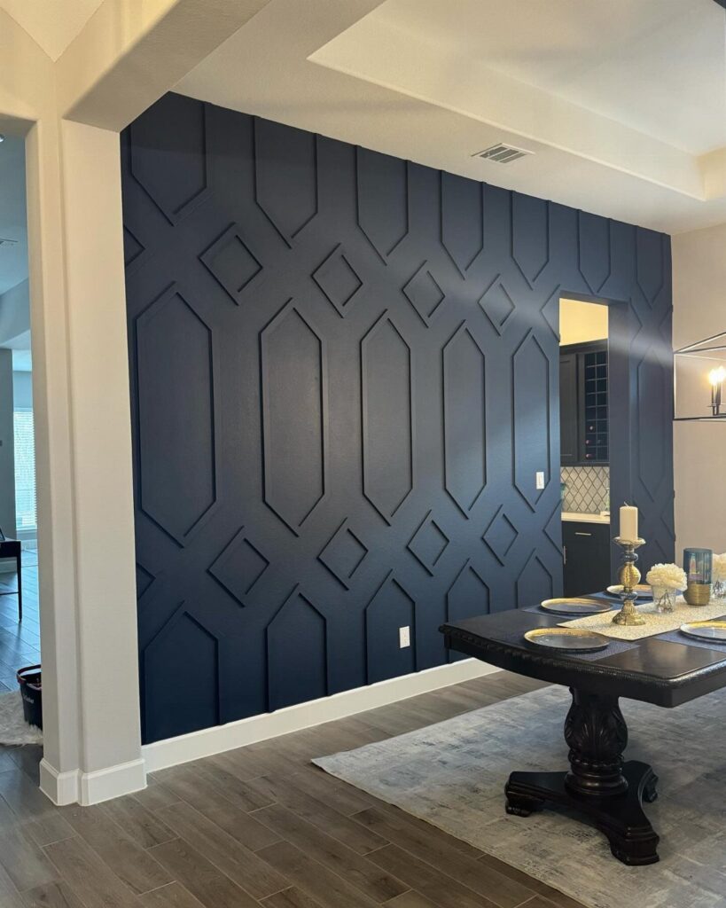
Slatted or paneled geometric walls add real relief, so shadows shift across the surface as the day moves.
That sculptural quality is why I prefer them in a single dark or mid tone: color stays out of the way and the pattern does the work.
Light grazing the surface gives the best result, so put a chandelier or wall light nearby. Expect more cutting and measuring than with paint or paper, so plan a full weekend and buy a little extra material.
4. Gallery Wall
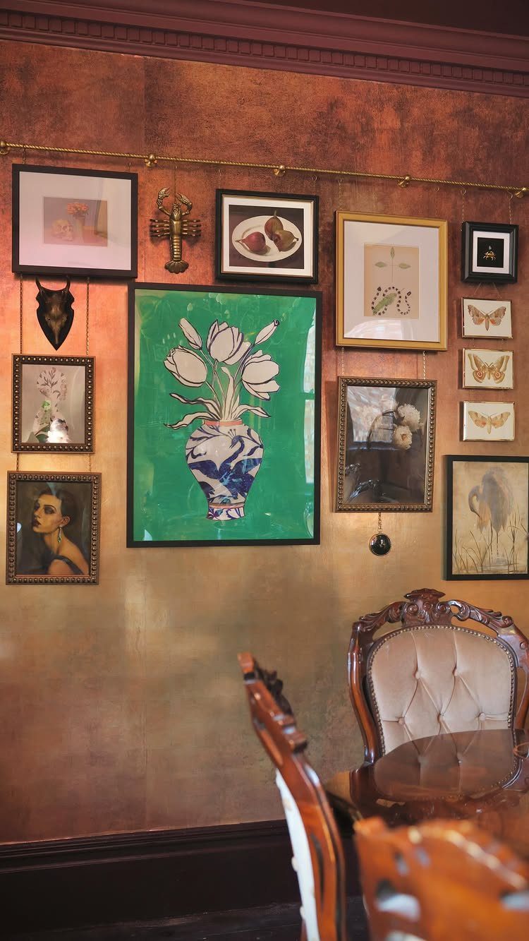
Mixed-size frames hung above the table turn the wall into a gallery, and it ends up the most personal accent wall you can build, since it’s made of prints, photos and thrift finds you already own.
A strong background color, like the textured orange seen here, helps the art stand out.
Lay everything on the floor first and arrange it until the spacing looks even.
Then trace each frame onto paper, tape the paper to the wall, and hang from that. Mix in one sculptural object for variety.
5. Mirror Accent Wall
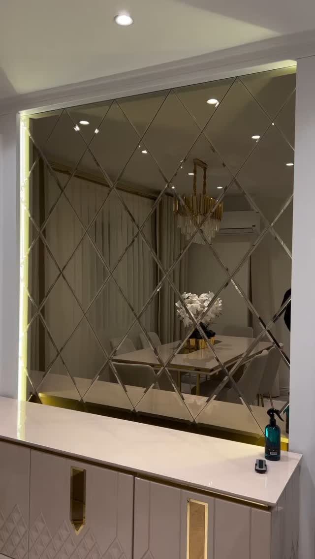
A mirror wall pushes the room outward, bouncing light from the chandelier and doubling the view of the table. A diamond pattern adds a little character over one big plain sheet, with the seams working as part of the design.
Glass is heavy and unforgiving, so measure twice and plan how it will be fixed to the wall.
Mirror tiles are the friendlier route for a DIY budget. A plain, low-profile sideboard under the mirror works best, since anything busy there competes with the reflection.
6. Reclaimed Wood
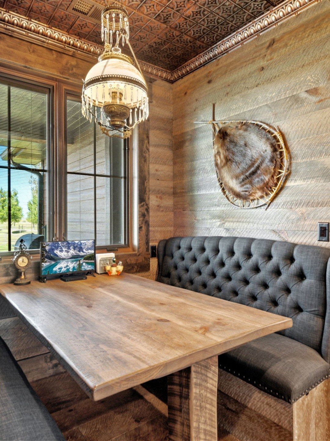
Reclaimed planks bring warmth and a worn character that fresh paint cannot copy, which makes them a good match for a cozy nook with a banquette. Each board differs in tone and grain, so the wall never looks flat.
Mix the lighter and darker boards as you go rather than hanging them in order.
Keep the rest of the room calm, with soft upholstery as a contrast to the rough wood. Reclaimed wood costs more than paint, so cover one wall only.
7. Textured Plaster
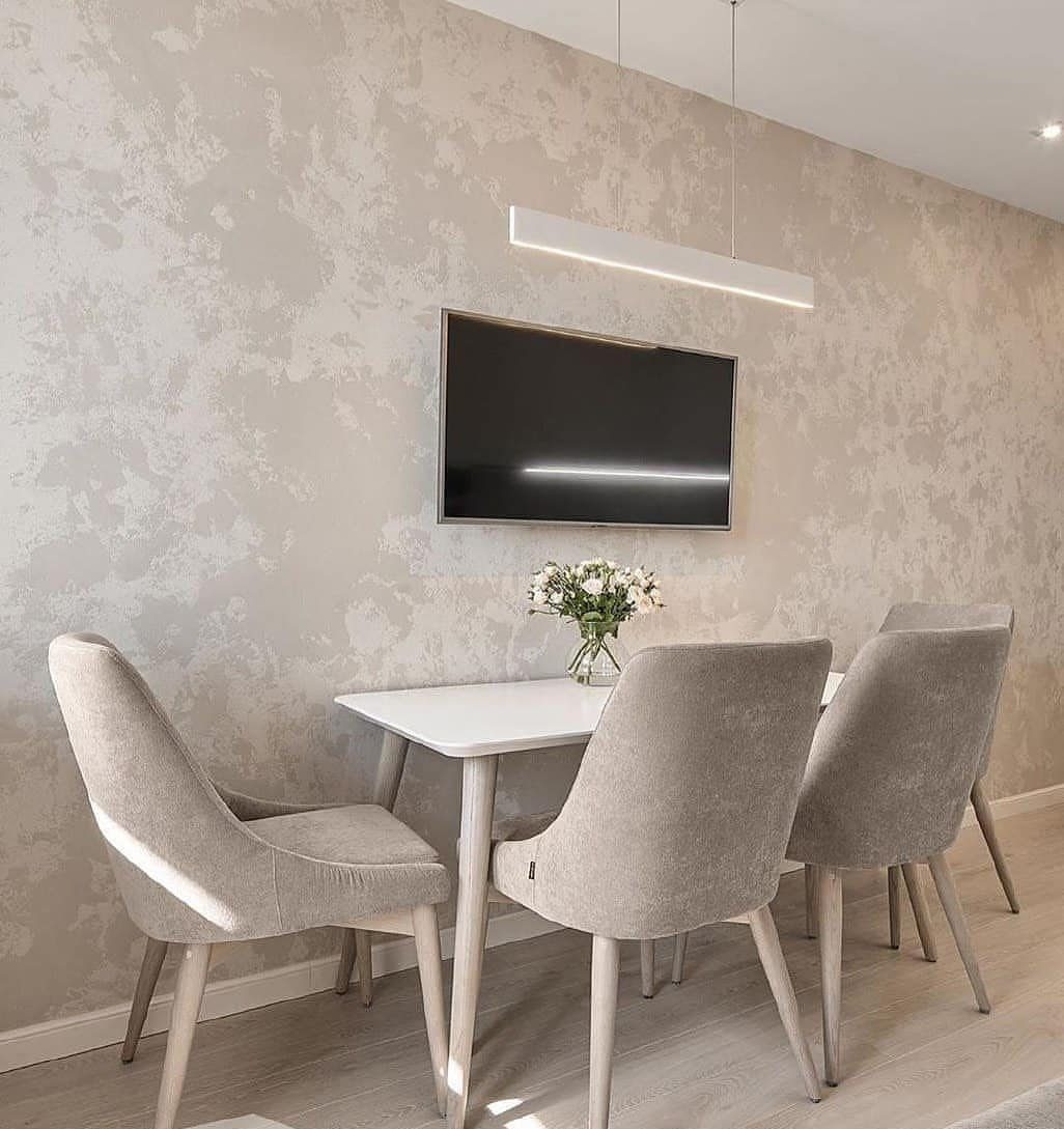
Textured plaster gives a dining wall a soft, hand-troweled depth, and grey is the tone I’d choose for it because the surface does the talking. Light slides across the ridges and the color seems to shift through the day.
Keep everything near it quiet, as in this room: a white table, plain chairs and one clean pendant.
A wall-mounted TV works against a surface this tactile, so I’d leave the plaster wall bare, or give the screen a different wall.
8. Striped Accent Wall
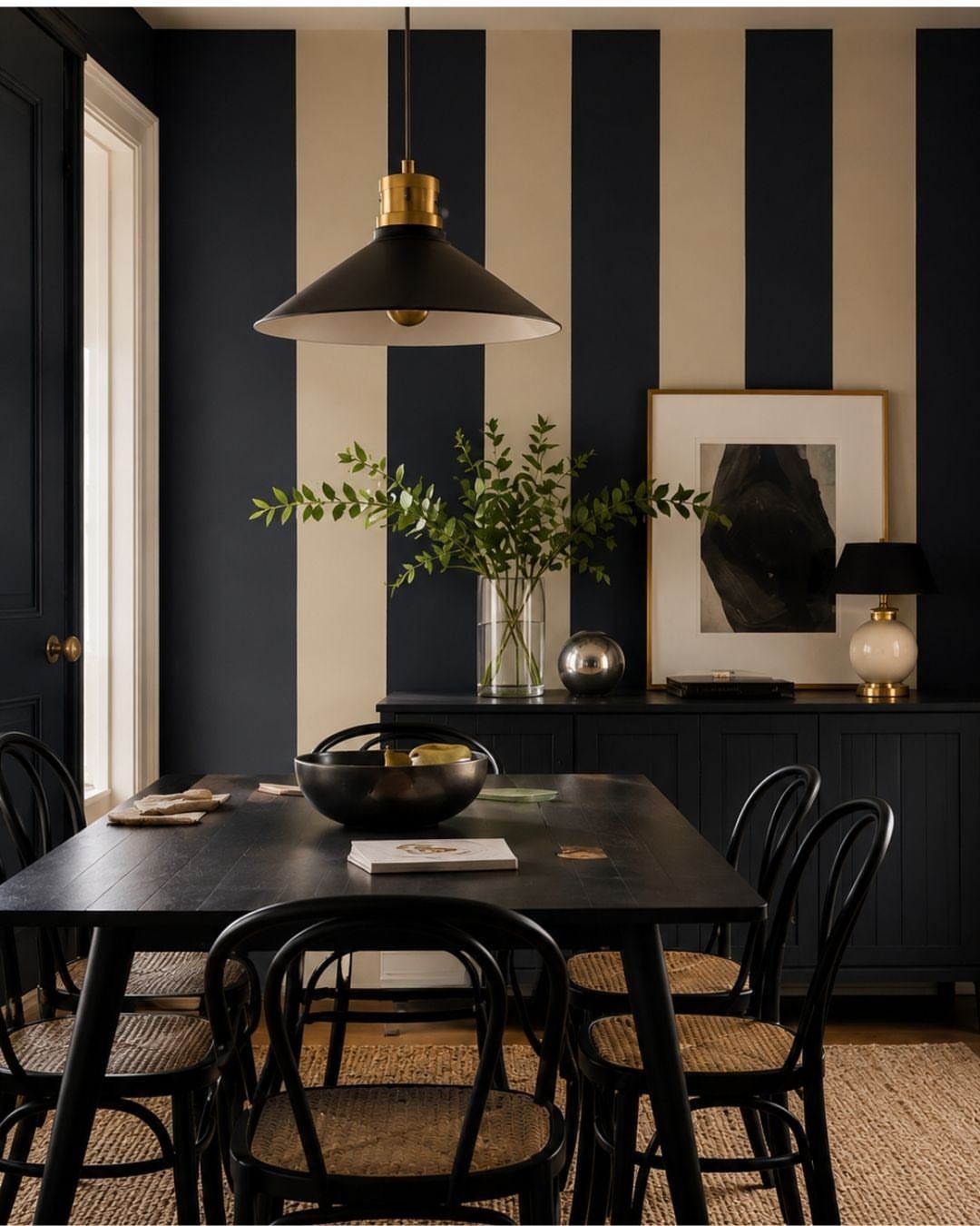
Vertical stripes draw the eye upward, so a dining room with a modest ceiling reads taller and a little larger. Pairing a dark stripe with a cream one keeps the pattern crisp and gives black furniture something to sit against.
Paint the stripes on the one wall behind the table and leave the other three solid, or the pattern starts to crowd the room.
Painter’s tape and a level line are all a weekend job needs, and pressing the tape edge down firmly keeps the lines sharp. Hold the sideboard styling simple, since the wall already supplies the movement.
9. Vertical Garden
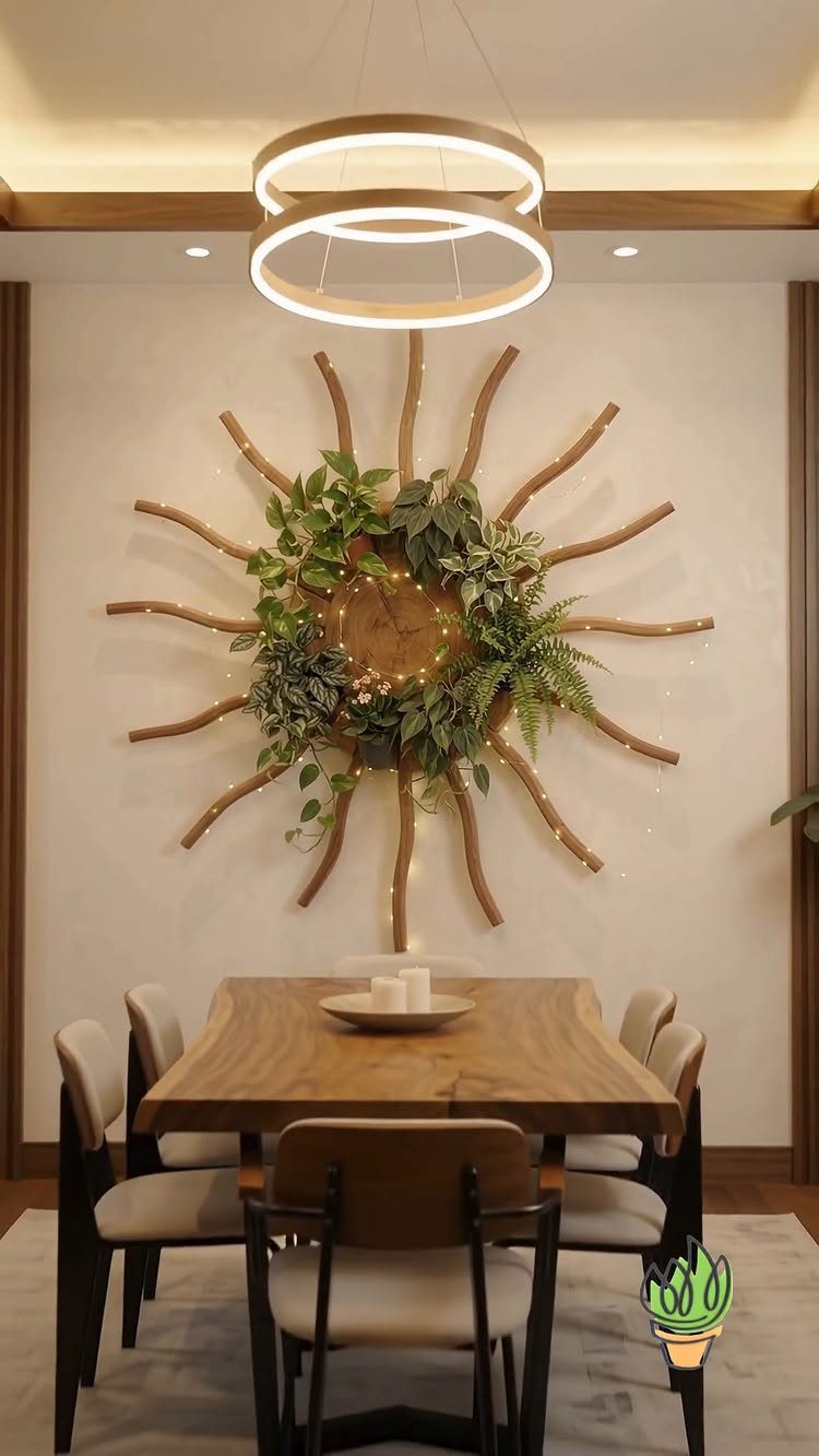
A living wall brings green into a dining room, and a sunburst frame like this one gives the plants a shape to follow instead of a loose, messy grid.
Its maker mentions built-in lights, which I’d copy, because plants on a wall in a dining room need a steady glow to look good at dinner.
Pick low-fuss plants and keep the wall within reach, since watering a high one gets old fast. A wood frame also pairs well with a wooden table.
10. Plate Collection Wall
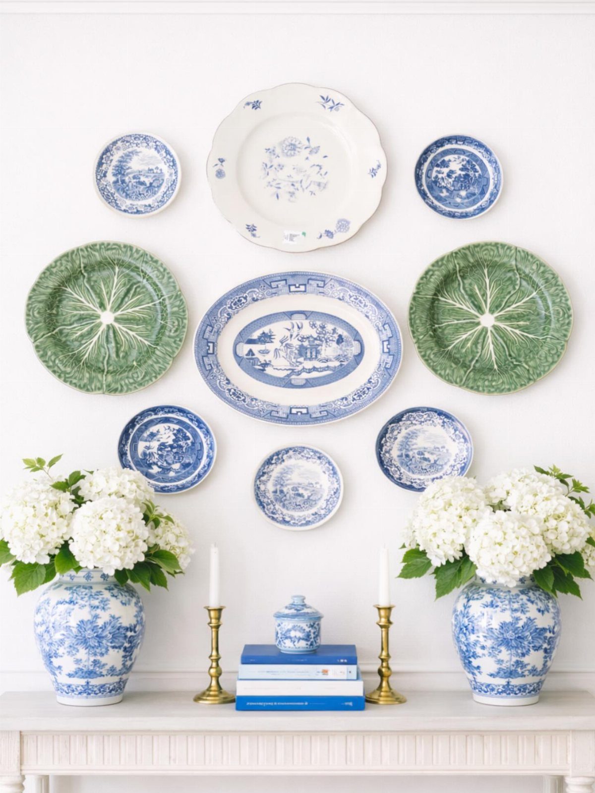
Plates hung in a symmetrical block turn dishes you already own into art. Blue, white and green plates over a white wall and console look deliberate because the palette stays tight.
Arrange them on the floor first, then trace each plate onto paper and tape the templates up to set the spacing.
Plate hangers are cheap, and a thrift store is the best place to fill gaps. Keep the console below tidy, with a few vases and books, so the plates stay the focus.
11. Wainscoting
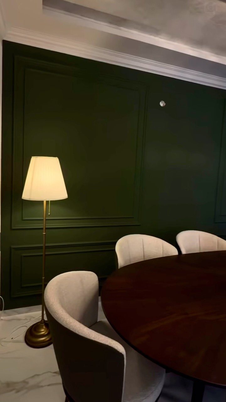
Wainscoting splits the wall in two, with paneled molding below and open wall above, and a dark green paint over the whole thing makes the molding look richer.
Painting panels and wall the same color keeps the shadows doing the detailing.
Molding kits and pre-cut panels suit a weekend and a modest budget better than building frames from scratch.
A matte or eggshell finish keeps the green looking deep instead of shiny, and a warm brass or gold lamp nearby brings out the richer undertones in the color.
12. Color Blocking
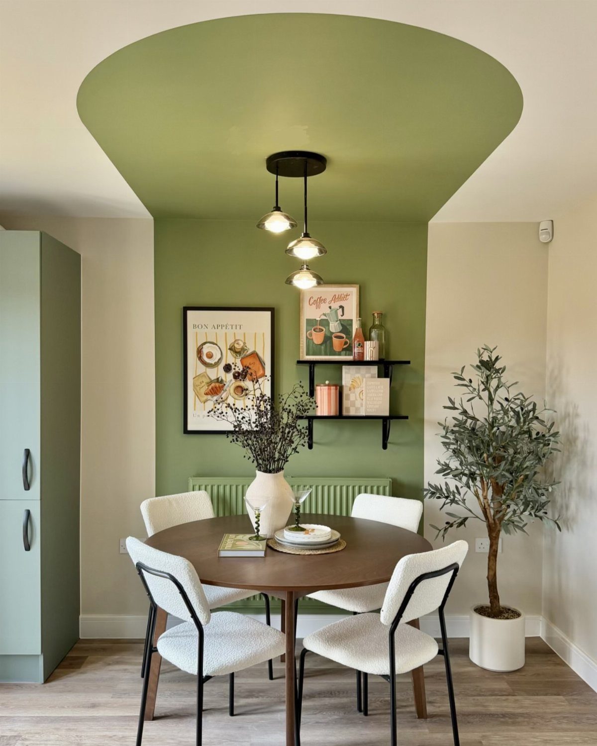
In a small nook, I’d paint the ceiling too. Carrying one sage green up the wall and across the ceiling makes the corner feel wrapped and deliberate, not chopped into a box.
Cut in the edge where wall meets ceiling first, then roll.
Pick a color with some warmth so the nook doesn’t turn cold. White chairs and a wood table keep it fresh, and a potted olive tree adds a second green without crowding the space.
13. Minimalist Tone-on-Tone
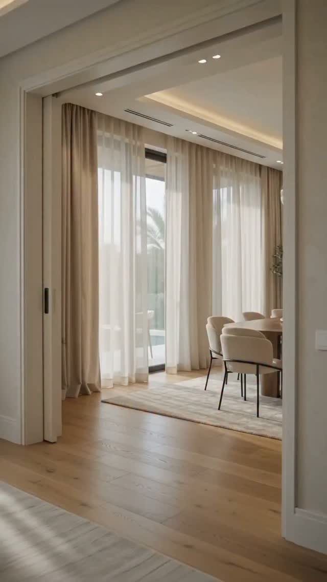
Painting the walls, hanging curtains and choosing a floor in near-matching beiges gives a dining room a calm that contrasting colors can’t.
The depth comes from small shifts in shade, with the curtains a touch lighter or darker than the wall.
For a renter on a budget, curtains are the easiest layer to adjust, so buy the paint first and match the fabric to it.
Hold up a swatch in daylight and at night before you commit, since beige can swing pink or yellow under different bulbs.
Keep the table and chairs in the same family, and let the wood floor supply the warmth.
Choosing the Right Wall
Paint or finish a wall that the furniture already sits against in a deeper shade, and it looks built into the room; the table and chairs give the color something to hold onto.
Skip walls broken up by a doorway or windows. They don’t offer enough solid surface for a statement, and whatever you apply gets chopped into small pieces.
Ceiling height matters too.
On a tall wall, vertical patterns such as wood slats or stripes work well. Over a long, low buffet, a short wall suits horizontal lines, or a block of color that stretches out toward the corners.
Lighting Considerations
Side lighting decides whether texture shows. Unlit, the wall goes flat and murky, and a weekend of work disappears, so pick the light fixture before you pick up a brush.
Sconces set beside a grid of mirrors double up: you get 2 lights and twice the glow. They also multiply every speck of dust, so wipe the glass before guests arrive.
Slats and panels give a layered depth that paint alone can’t, which is worth weighing if flat color feels too thin for the room.
Common Mistakes
Skip dark, saturated paint in a small dining room that gets little daylight. It can make the space feel even smaller, and in a tight room I’d go lighter and skip the accent wall.
Limit yourself to one standout wall. Several "accent" walls compete with each other, and the eye has nowhere to rest.
Check it against the colors and architecture already in the room first.
Tie the wall in with other decor, such as textiles, art or tableware, so the color doesn’t feel stranded.
The 60-30-10 rule helps here: 60% main color, 30% secondary, 10% accent.
Frequently Asked Questions
Which wall should be the accent wall in a dining room?
Pick the wall behind the table. The furniture already sits against it, so a deeper color or finish looks built into the room.
A wall cut up by a door or windows is a poor candidate, since the leftover stretches are too narrow for a bold finish to read as one surface.
Are accent walls out of style in 2026?
No, they’re still popular, but the look has moved past a single bold paint color. Textured finishes like wood slats, 3D panels and plaster add depth that flat paint can’t, and that layered effect is what reads as current.
What are the dining room trends for 2026?
Right now I see deep navy paired with brass lighting, plaster with enough texture to throw soft shadows at night, and thin black wood slats in a geometric pattern set against warm white.
If you rent and want a big change you can undo, a peel-and-stick mural or a thick woven wallpaper fits in a single weekend and comes off when you leave.