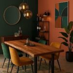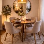
The layouts here range from a strict grid of 6 identical frames to a loose mix of prints in different colors and frame sizes, and the cost stays low either way, since a can of gold paint can stand in for new frames.
Whichever you pick, fix one shared feature first, such as frame color or mat width, so the wall reads as planned.
1. Grid Gallery Wall Layout
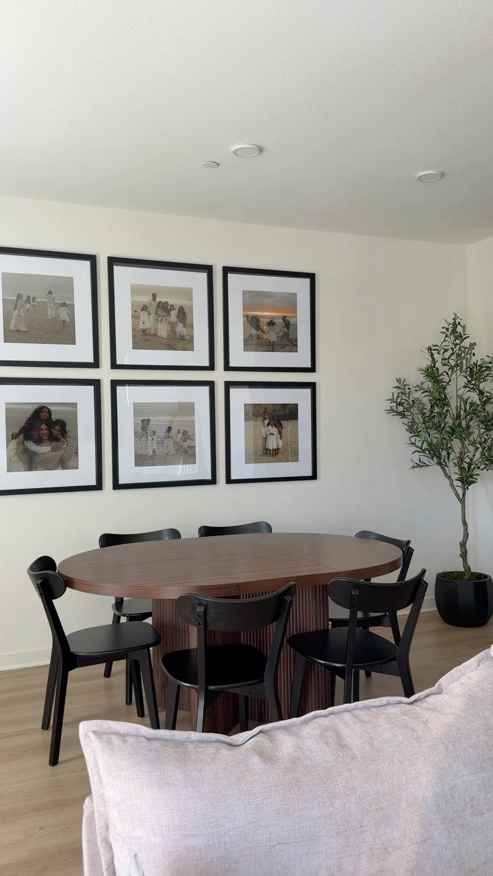
Six frames in two rows of three give a dining wall the calm of a set table.
A grid asks for identical frame sizes and even gaps, so the wall reads as one block instead of a scatter of separate pictures.
Cut paper templates, tape them up, and adjust before any nail goes in. A free-form layout is looser and more forgiving of crooked walls, but I’d pick the grid when the table below is simple and the room needs order.
2. Cohesive Gallery Wall
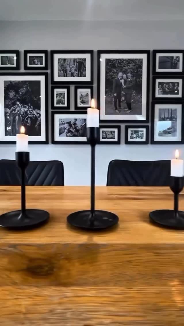
Repeating one or two elements is what makes a gallery wall look planned. Matching black frames and a single photo style, black and white, do that work here, and the wall holds together even when the subjects differ.
Pick your common thread before buying anything: frame color, mat width, or image tone.
I’d keep at least two of those fixed. A mismatched layout can still look intentional, but a shared frame is the cheapest way to get there.
3. Family Photos Gallery Wall
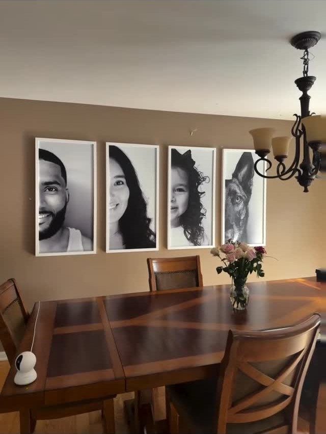
Portraits of the people who sit at the table belong in a dining room more than almost any art does. Printing them in black and white hides the clash of different outfits, lighting and backgrounds.
Order prints at one size and put them in matching frames.
White frames, in my view, keep a dark wall from swallowing the faces. Include the dog; pets make the wall feel lived in.
4. Black and White Prints
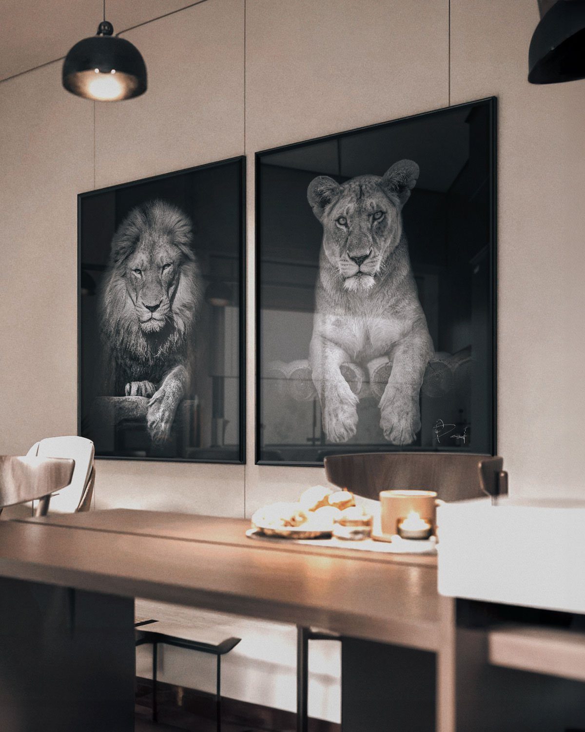
Large black and white prints suit a dining room because they never fight the tablecloth, the dishes or the food. 2 oversized frames, side by side, beat a crowd of small ones when you want impact without clutter.
Choose a subject with strong contrast so it reads from across the room. Hang the pair with an even gap between them, and center them over the table rather than the wall.
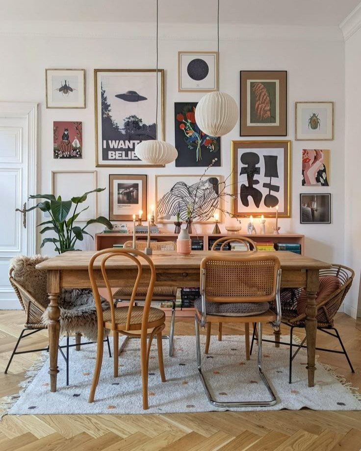
5. Eclectic Prints
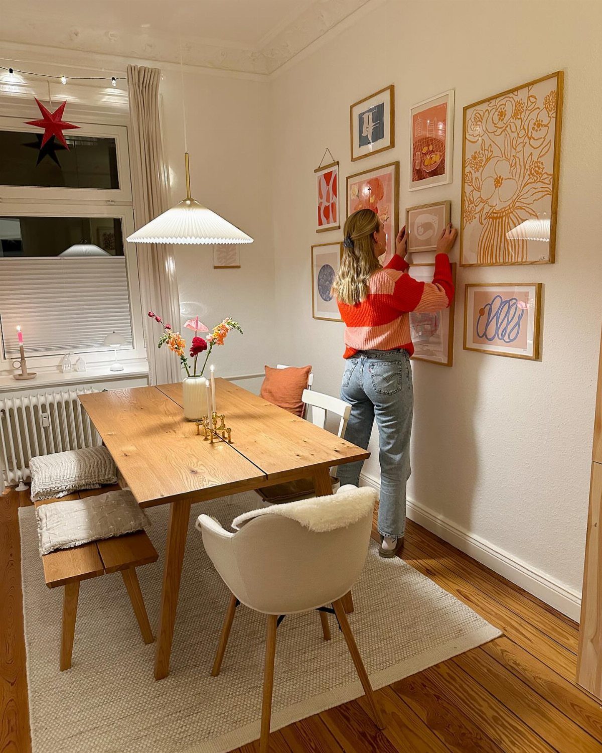
Mixing prints in different colors, styles and frame sizes makes the wall playful, and it is the most forgiving layout for a renter collecting pieces over time. Nothing has to match.
Lay everything on the floor first and shuffle until the heavy pieces are spread out.
Then trace each frame onto paper, tape the paper to the wall, and nail through it. You can move a template a dozen times without leaving a single extra hole.
6. Bold Hues Gallery Wall
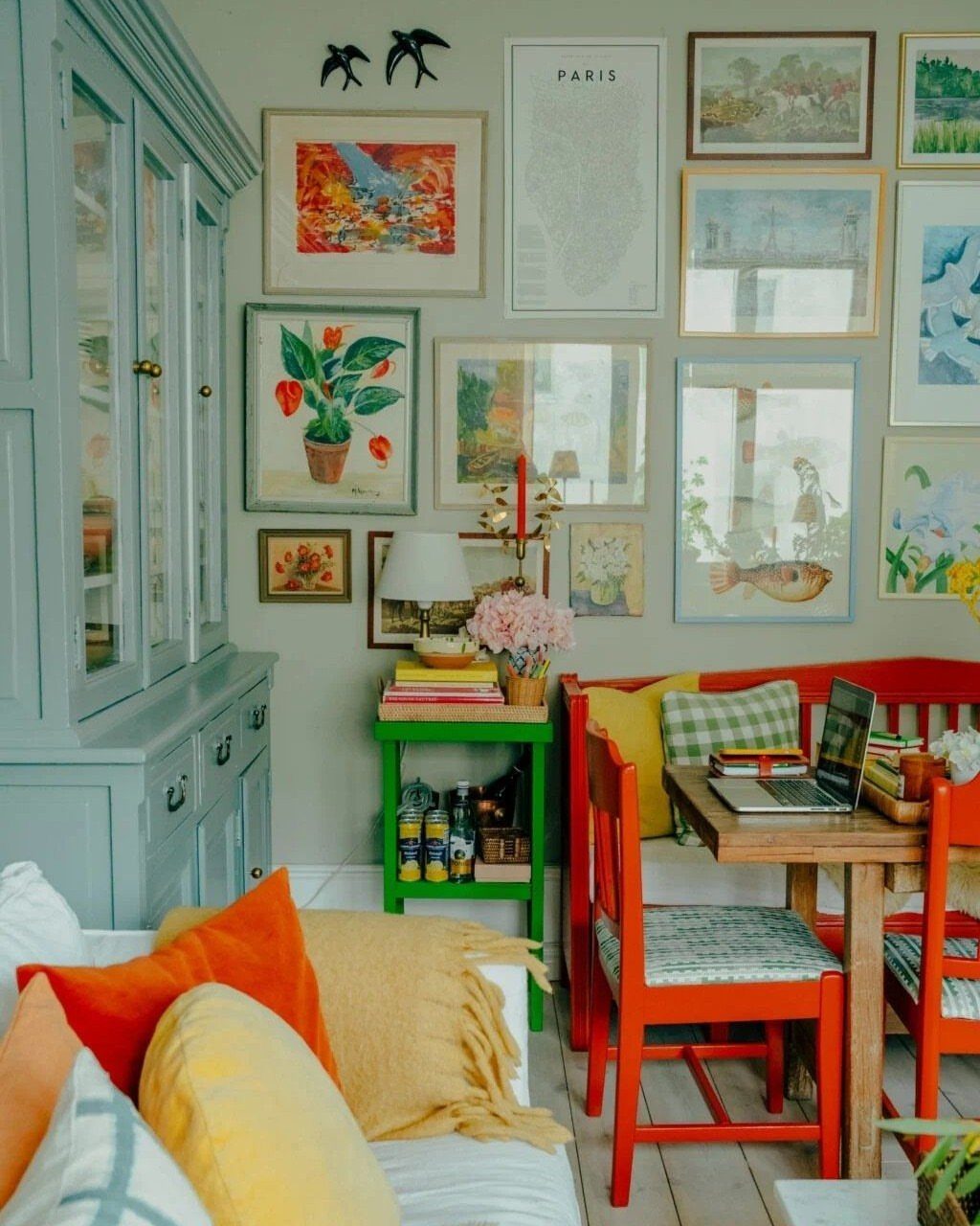
Red chairs, a blue hutch and a wall of saturated art can share one corner if each color repeats at least once. Here the reds and blues echo across furniture and frames, which keeps the nook from feeling random.
Start with the furniture in the room now and pull your print colors from it.
A single map, like the one reading "PARIS", adds a neutral anchor among the brights. Keep the wall behind the art simple.
7. Curated Art Collections
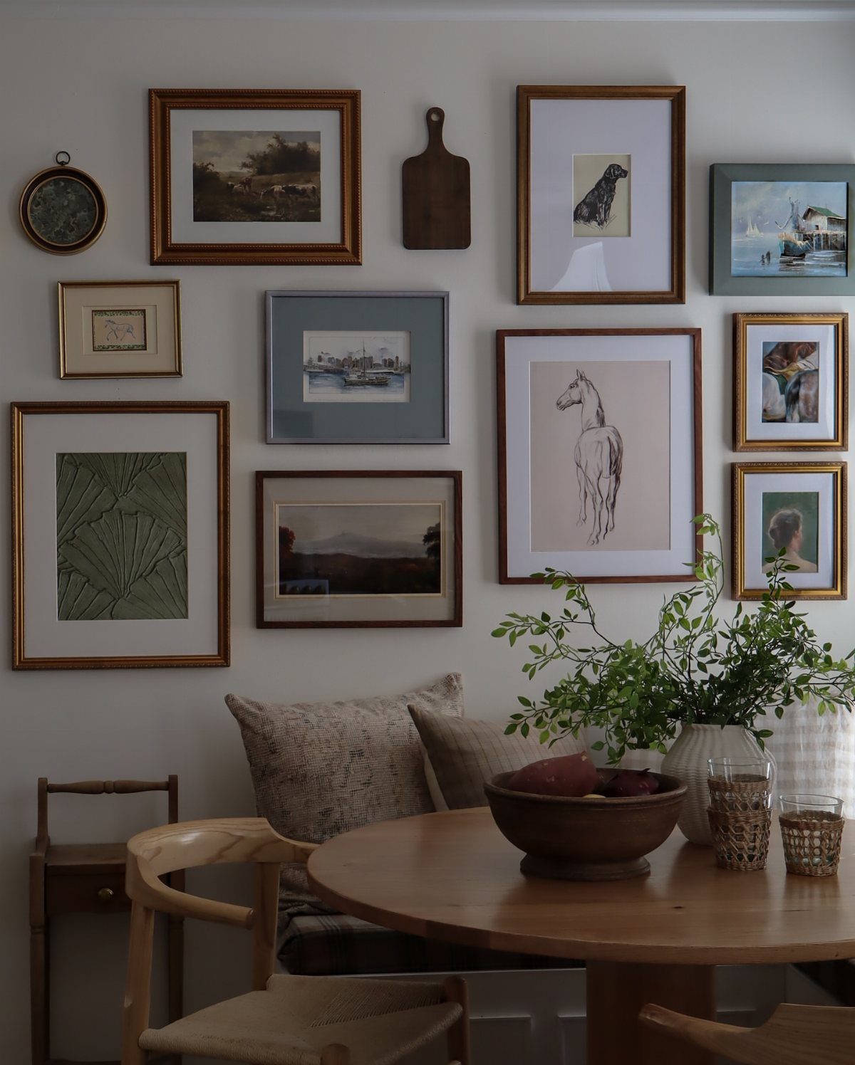
A mix of framed art with one wooden cutting board hung among the frames makes a wall feel gathered over time instead of bought in one trip. The board adds a warm, textured piece that echoes the wood table below.
Choose a handful of pieces you love, then add one non-art object for variety.
I’d keep the board near the center so its weight balances the frames around it. Lay it all out on the floor before nailing anything.
8. Gold-Framed Landscape Art
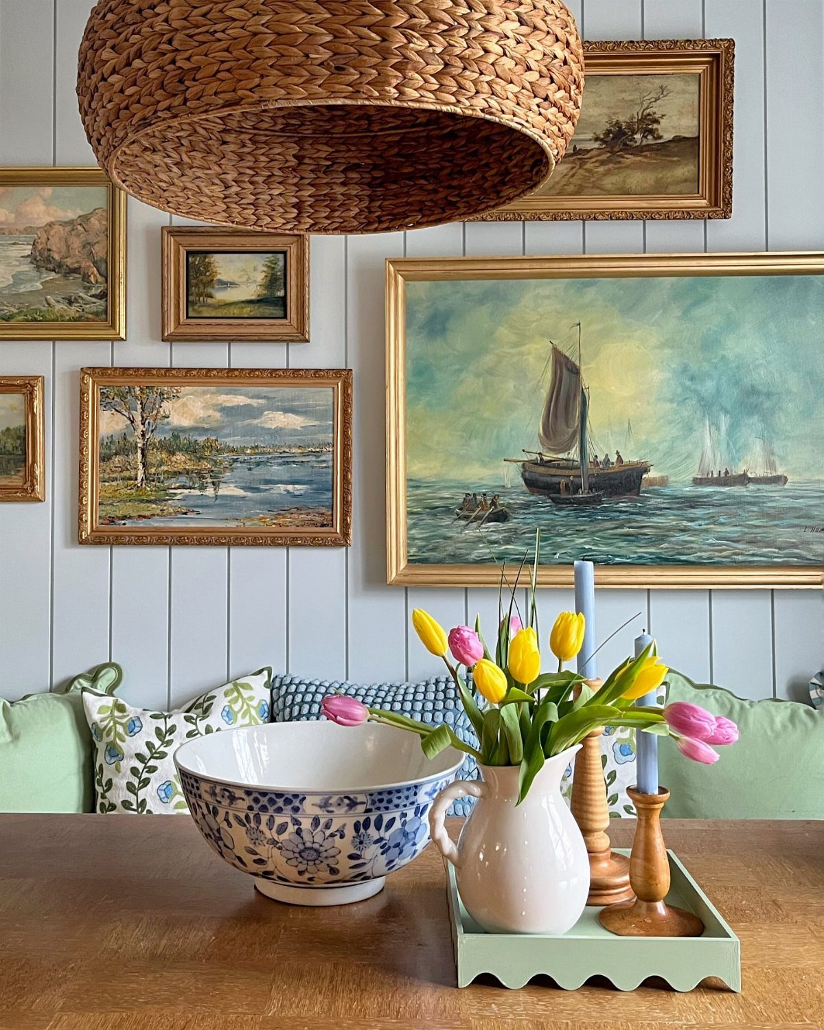
Gold frames on light blue paneling give landscape paintings a warm glow against a cool wall. Hanging them asymmetrically, in mixed sizes with uneven spacing, keeps the look relaxed instead of formal.
Gold and blue sit opposite each other in tone, so the pairing feels deliberate.
Stick to landscapes as the single subject, then vary the frame sizes so the group has some rhythm. I’d keep the gaps tight and the whole group centered over the table, so it reads as one cluster.
Thrifted landscapes are the budget route; a can of gold paint can unify frames that don’t match.
Creating a Cohesive Look
Pick one shared feature first, whether that’s a frame color, a mat width, or a single color running through every print, and only then start shopping for frames.
Frame color, shape, size or overall style all work, and naming it early makes every later choice easier.
Let the room decide which one.
Look at the style of the space and the colors already in it, then pick the common element that fits. A gallery wall can hold very different subjects as long as that one feature stays fixed.
Choosing the Right Frames
Match the frames to the room’s style.
Layout follows the same logic. If you can’t decide, a floor-to-ceiling wall is a safe bet, and mixing framed and unframed pieces adds an easy, casual feel.
Gallery Wall Benefits
A gallery wall brings personal style into a dining room, and it can add color and pattern to a space that’s mostly neutral. Because it’s only frames and paper, you aren’t locked into a long-term decorating choice.
Placement matters too.
The wall you see on entering is the safest spot, since the display is always in view. A blank wall elsewhere works if you want to fill it and give the room a focal point.
Frequently Asked Questions
How to decorate a dining area wall?
A gallery wall is the easiest way to dress a dining wall.
A gallery wall is an easy way to bring color, pattern and some personality into a mostly neutral room, and because it’s just frames and paper, a change of mind costs you a few dollars.
One shared feature, like a single frame color, is enough to hold the whole arrangement together.
How to make pictures look nice on a wall?
Before hanging anything, settle on what the pieces have in common: matching mat width, a repeated frame finish, or one color that appears in every print. Then lay everything on the floor and trace each frame onto paper.
Cut paper templates for each frame, tape them up, and shuffle them around until the wall looks right, so the nails only go in once. That keeps the group looking planned and saves you from extra holes.
What are some neutral colors that would look good in a dining room?
Black and white is the safest neutral pairing for dining room art, since large black and white prints never fight the tablecloth, dishes or food.
A gallery wall can then bring in color and pattern against neutral walls without a long-term commitment. A neutral map among bright pieces also works as an anchor.
What layout to choose for a dining room gallery wall?
Choose a grid for a simple table and a room that needs order, and a free-form layout for something looser.
With a grid, every frame is the same size and the gaps stay even, which makes the wall read as a single block. A free-form arrangement hides crooked walls and works well for a renter who adds pieces over time.