Whether you rent or own decides most of this list: peel-and-stick mural panels, plug-in sconces and adhesive plate hangers leave the walls alone, while an accent wall, picture frame molding or a gallery wall asks for paint, glue or hammered holes.
The ideas run from a paint roller and a deep accent color to textured panels, molding and a full botanical mural.
Wall size narrows things further, because the space above a 48-inch sideboard has far less open height than a full wall, so width, not height, sets how big the art can be.
1. Gallery Wall
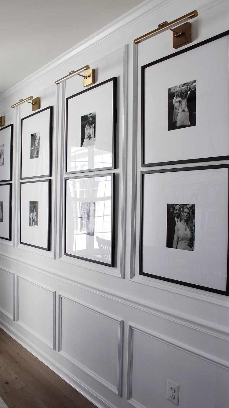
Matching frames do most of the work in a grid like this.
Identical black frames with one photo tone, black and white, read as a single piece instead of a cluster of small ones, which is why I like this version for a first gallery wall.
Keep the gaps between frames even and cut paper templates to tape up first. Hammering only after the layout looks right saves you from patching holes on a rental wall.
2. Floating Shelves
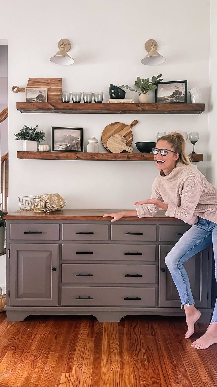
2 shelves stacked above a sideboard give you a place to rotate things as the seasons change.
Keep the decor to a few pieces: one larger art piece leaning at the back, a smaller object in front, and some empty space between them.
Dark wood against white walls gives strong contrast, so the shelves themselves become part of the look. Anchor them into studs or use proper wall anchors, since shelves holding art and decor carry real weight.
3. Large Piece of Artwork
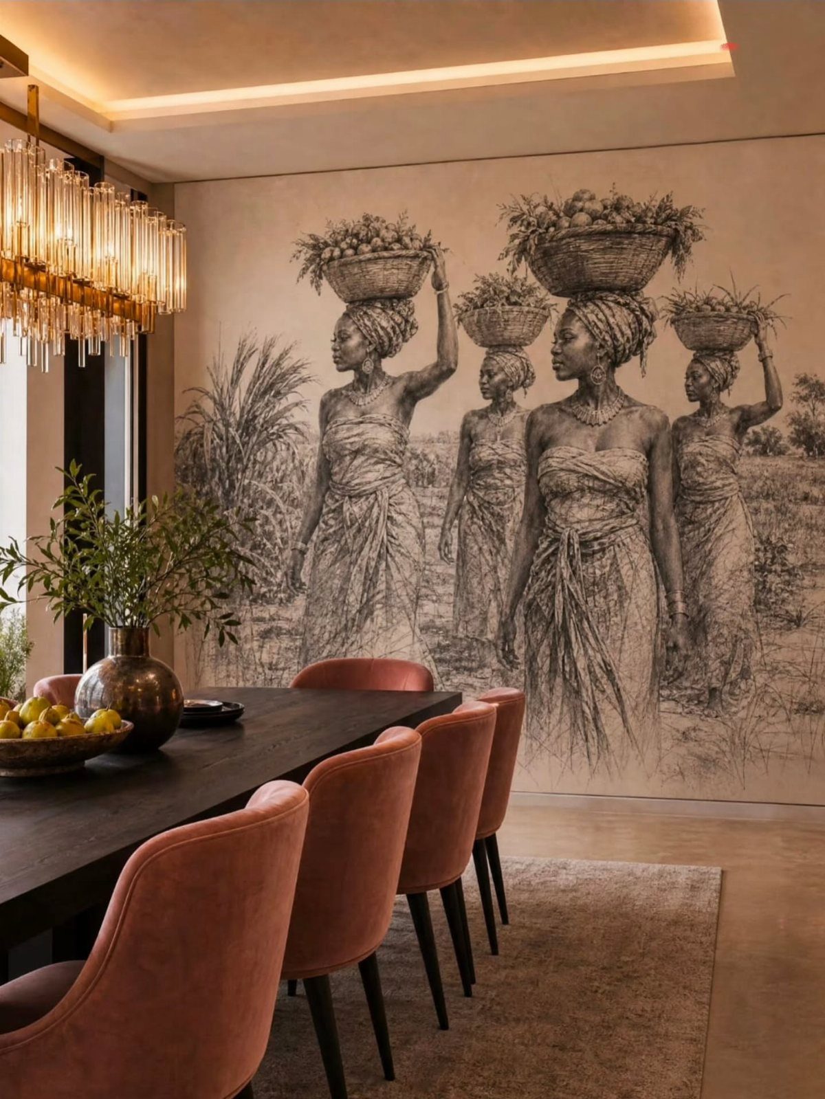
One oversized piece beats a cluster of small ones in a dining room where the table already fills the floor. A single large sketch gives the wall a clear focal point and leaves the rest of the room calm.
Pick a piece that is roughly two-thirds the width of the table or sideboard below it.
Black and white work is easy to live with because it won’t fight the chair color, and a bold seat color then does the talking.
4. Wall Mirrors
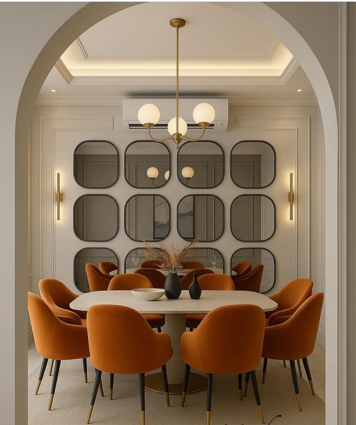
Mirrors earn their spot in a dining room by bouncing light around and making the walls feel farther away. A grid of rounded rectangles does this while still looking like decor instead of a plain glass panel.
Hang them so the reflection catches your chandelier or a window, not a blank corner. Space them evenly, and use a level on the first row, because crooked mirrors show every error.
5. Statement Wallpaper
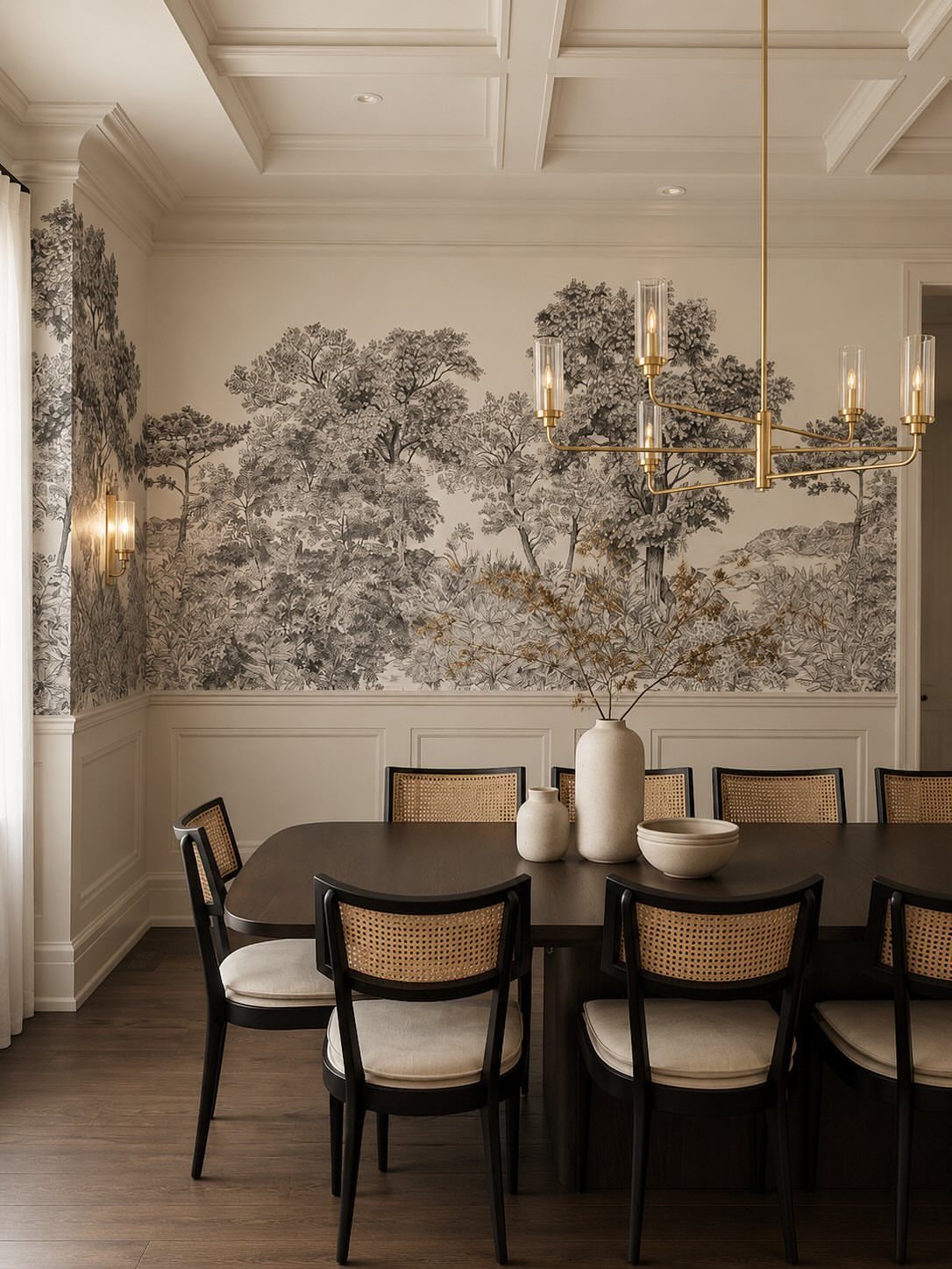
Wallpaper with a big scenic pattern gives a flat room architecture it never had. A monochrome forest adds depth, so the wall seems to run back into the distance, and that works well behind a dark table.
For a rental, peel-and-stick mural panels are the safer pick. Paste-on paper looks best but costs more in labor, and a mural needs careful alignment, so order a little extra and measure twice.
6. Wall Sconces
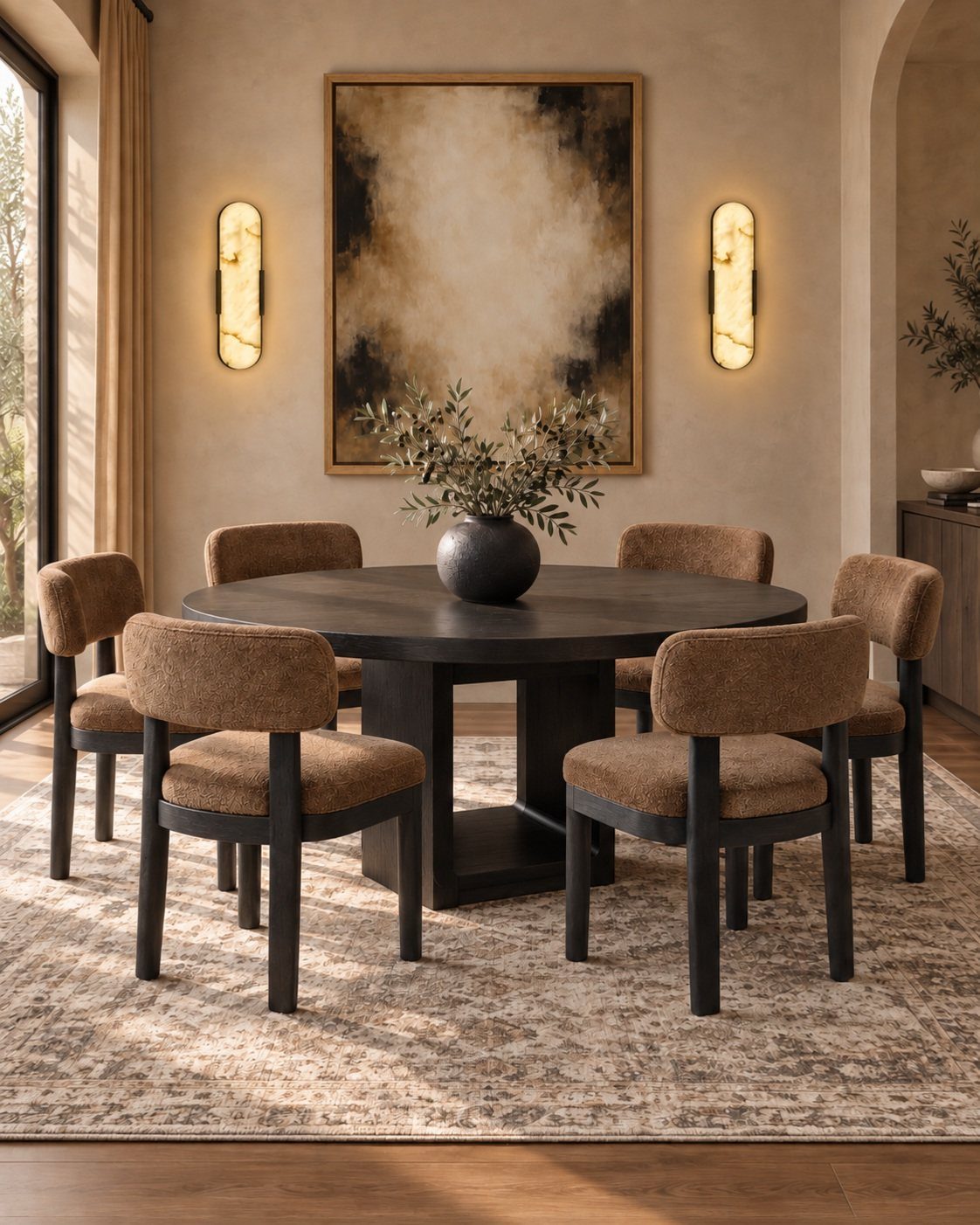
Sconces on either side of a large painting do 2 jobs: they light the art and they frame it. That symmetry makes a wall feel finished without adding anything else to it.
Warm bulbs flatter food and faces, and a dimmer is worth adding. If hardwiring is out of reach in a rental, plug-in sconces with cord covers painted to match the wall are the workaround I’d choose.
7. Textured Panels
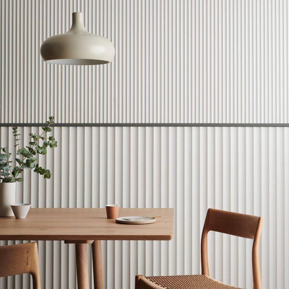
Vertical ribbing gives a plain white wall shadow and depth without any color, which is why fluted panels suit a room that already has a wood table and chairs.
A dark horizontal trim line across the panels adds a clean edge and keeps the white from looking flat.
Keep the pendant light and the rest of the decor simple here. The texture is already the feature, so one light fixture and a few table pieces are enough.
8. Plate Display
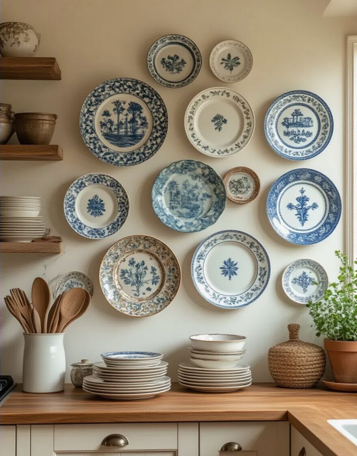
Heirloom plates look best when the patterns share a color family, and blue and white is the easiest one to build on. Mixed sizes and designs feel collected instead of matched, as long as the palette holds.
Lay the plates on the floor first and arrange them until the outline looks balanced, then trace each on paper and tape the templates to the wall.
Plate hangers with adhesive discs are gentler on a rental wall than nails, though I’d check the weight rating against your heaviest plate.
9. Chalkboard Wall
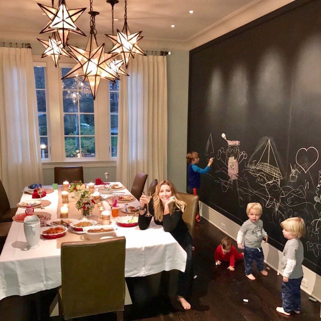
A chalkboard wall earns its place in a dining room by being decor and a working surface at once.
Black paint makes a deep backdrop, and whatever gets drawn on it becomes the art, from a menu to a kids’ doodle session.
Keep a small tray of chalk nearby so the wall gets used. Because the board stays dark, I’d keep the table setting light and simple so the room doesn’t feel heavy.
10. Molding and Wainscoting
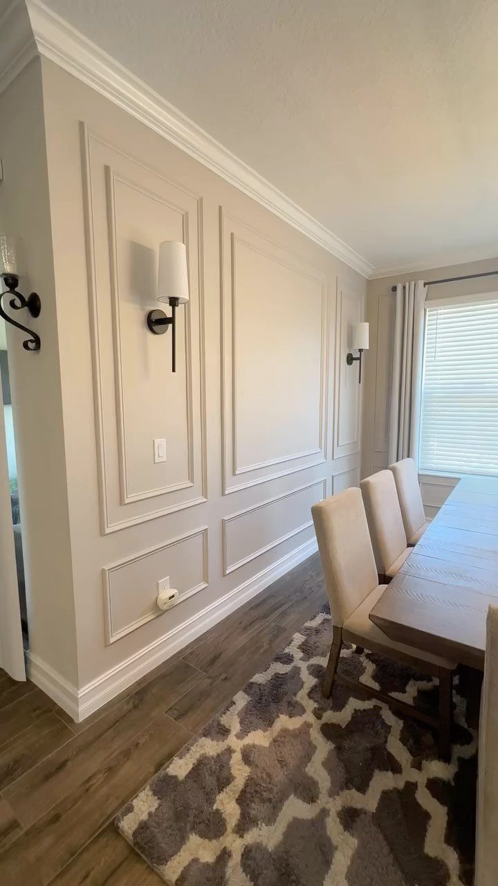
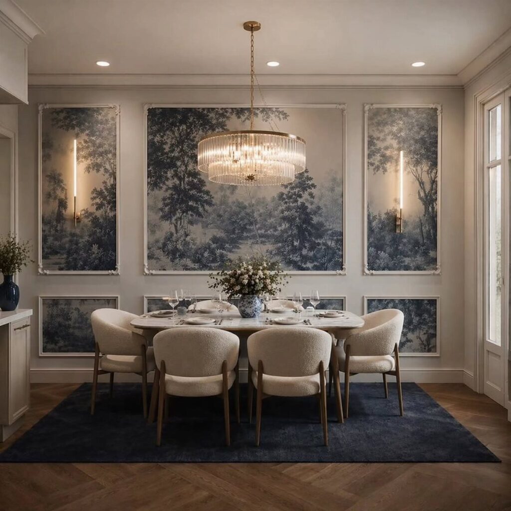
Picture frame molding draws rectangles directly on the wall, giving a flat beige surface the look of built-in paneling. 2 sconces set between the frames add light without crowding the wall.
Paint the molding and the wall inside it the same color for a quiet, tailored finish. Measure and mark the layout in painter’s tape before gluing anything up, so the rectangles come out even and centered.
11. Botanical Wall Mural
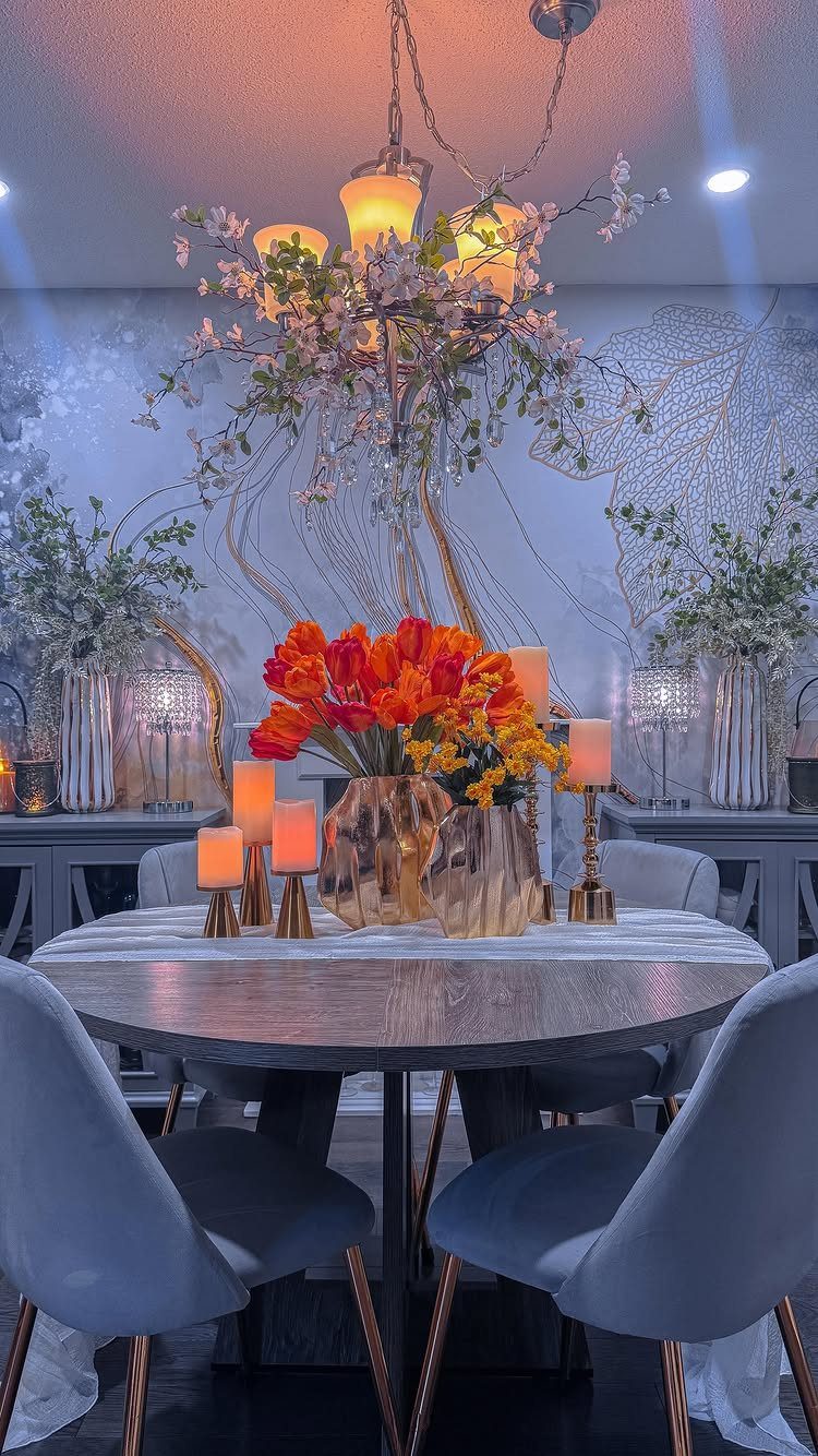
A light-colored botanical mural behind a round table reads soft and airy, and it pairs naturally with fresh flowers like the orange tulips on the table. Pale linework lets the wall stay delicate instead of overwhelming a small room.
Keep the table pieces few and let one accent color repeat from the flowers. A floral chandelier overhead echoes the mural, but a simple fixture works too if you want the wall to lead.
12. Framed Typography Prints
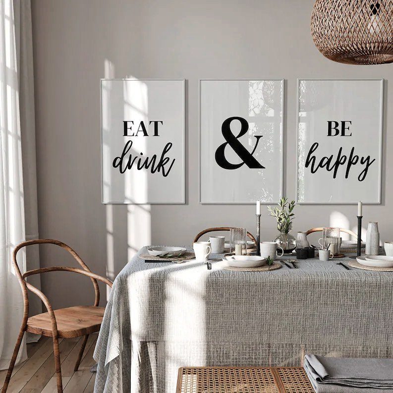
Three framed prints hung as one sentence, "EAT drink & BE happy," turn a plain grey wall into a message above the table. Splitting the phrase across 3 frames feels more designed than a single sign.
Use identical frames and keep the gaps equal, since the words need to read as one line. Hang the row centered over the table, and trim the spacing so it sits a hand’s width above the chair backs’ sightline.
13. Accent Wall
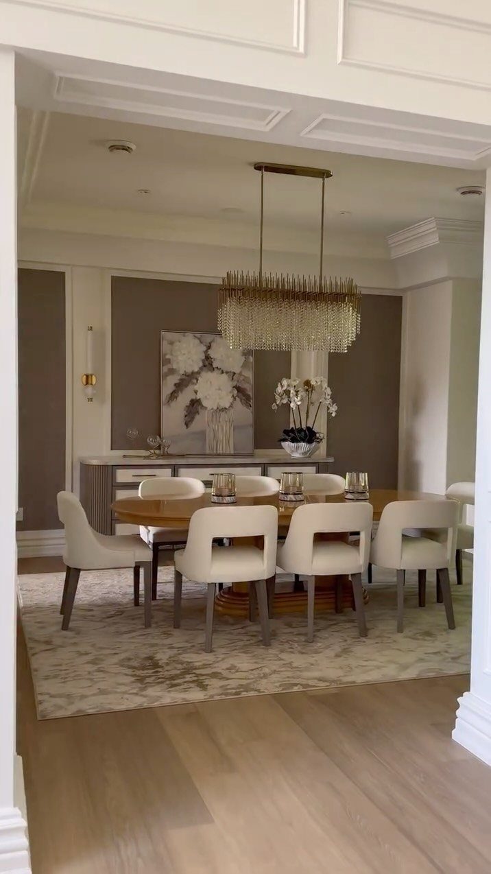
One wall in a deeper color gives a dining room a backdrop without the cost or labor of painting every surface.
A warm brown wall works because it sits calmly behind lighter furniture and gives a chandelier something to glow against.
Pair it with white or cream chairs, and pick a fixture with crystal or glass so the light has something to bounce off.
Choose the wall the table faces from the doorway, since that is the one people see first. Paint it with a roller in 2 coats, and tape the ceiling line and the adjoining walls before you start.
Keep the other walls light so the dark one stays the feature.
So whether you’re staring at your dining room walls in a different light or are decorating a new place from scratch, Minted is here to guide you through the process of selecting dining room wall art that perfectly complements your space and your personality.
— Minted
Choosing Wall Art Size
Measure the empty wall first, then multiply the height and width by 0.6 and 0.75.
That range applies to the clear wall height, measured from the chair rail or wainscoting up to the ceiling, minus any space a buffet or sideboard will cover.
A 9-foot-tall, 5-foot-wide wall works out to art roughly 5.4–6.75 feet tall and 3–3.75 feet wide. Most walls above furniture won’t have that much open height, so use the width as your guide.
A 48-inch sideboard calls for art or a grouping about 29–38 inches wide.
Cut a paper mockup, tape it up, and live with it for a day before you hammer anything. Paper costs nothing, and it shows you a wrong size fast.
Lighting Considerations
Light a dining room in layers. Overhead light does the main work, while sconces and candles add depth and make food and faces look good.
Look for bulbs rated 2700–3000 Kelvin, the number printed on the box. That range gives a warm, flattering glow, and a dimmer lets you lower it for dinner.
The fixture should follow the table’s footprint: round pendants or drum shades over round tables, linear chandeliers or rectangles over rectangular ones.
A fixture about one-third the width of the table is a safe size, and you can go bigger if you like the look.
Hang it so the bottom sits about 30–36 inches above the tabletop. Any lower and it blocks the view across the table.
If a mirror is the focal point, make it the largest piece on that wall and keep nearby frames a bit smaller so the order is clear.
Color Palette Tips
I start with neutrals on the largest surfaces, then layer in color through the pieces that matter most. Warm neutrals feel cozy, cool ones feel crisp.
The 60-30-10 split holds the scheme together: 60% goes to the main color, 30% to a supporting tone, and 10% to the accent.
In a dining room, the walls usually take the 60, the furniture and rug the 30, and flowers, frames or small objects the 10.
An easier path is to pick the rug or upholstered chairs first, then pull two main colors and one accent straight from the fabric. They’re already in the room, so nothing will clash.
Repeat one metal finish across frames, sconces and hardware so the pieces feel related. Contrast keeps the wall from flattening out: pair light paint with dark frames, or reverse it and hang pale art on deep walls.
Frequently Asked Questions
How to decorate a dining area wall?
Pick one focal treatment and let it lead: a single large piece of art, a grid of matching frames, a set of mirrors, or one wall in a deeper paint color.
Mirrors work well because they bounce light and make walls feel farther away, especially when the reflection catches a chandelier or window. Keep everything else on the wall simple so the focal piece reads clearly.
What can I put on my walls to decorate?
Framed art, a gallery grid, mirrors, floating shelves, sconces, a plate display, textured panels, wallpaper or picture frame molding all work in a dining room.
Renters can lean on peel-and-stick mural panels, adhesive plate hangers, and plug-in sconces with a cord cover painted the wall color, since none of them leave holes behind.
Tape paper templates up first so you only hammer once the layout looks right.
What are some neutral colors that would look good in a dining room?
Beige, cream, and warm brown give a room a snug feel, and cooler grays and whites read crisper. Put a neutral on the largest surfaces, then add color through chairs, a rug, flowers or frames.