The wall color that works is the one that suits what’s already in the room, and the table and its wood usually decide it: warm wood wants a warm white or beige, dark wood balances against a pale wall, and a bold blue or navy needs furniture that can hold its own.
The ideas here run from a single deep yellow wall that costs one gallon and an afternoon to a full navy room that wants two coats at least.
1. Soft Whites Dining Room Wall Color
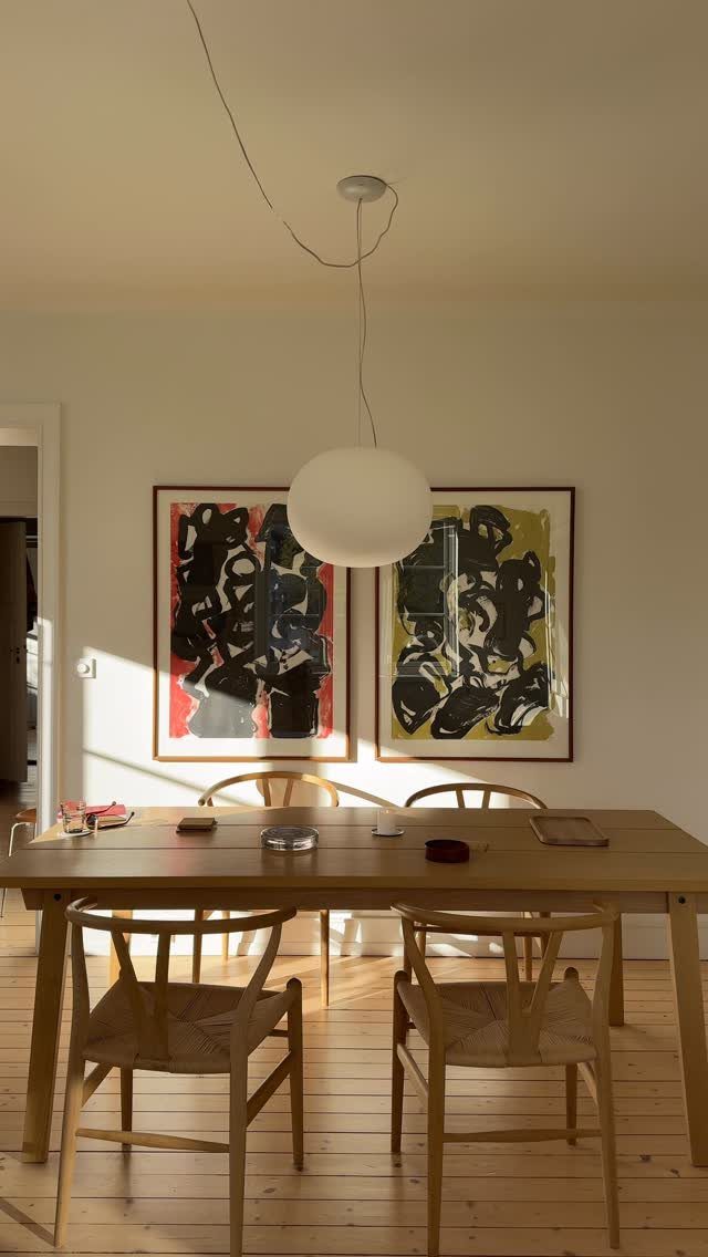
Soft white walls give a wooden table and a pair of abstract paintings room to be the color in the room. I like this setup because the art does the talking and the walls stay quiet behind it.
A big round pendant needs that calm backdrop too. Pick a white with a hint of warmth if your table is wood, since stark white can make the grain look orange.
Paint a sample on 2 different walls and look at it in morning and evening light before spending money on a full gallon.
2. Soft Gray
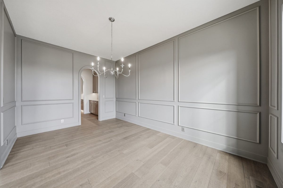
Gray walls with wainscoting and molding read as tailored, not cold, as long as the gray is light.
I would paint the trim and the wall in the same gray, or keep the wainscoting a shade lighter, so the woodwork shows without a harsh contrast.
Light wood floors and a silver chandelier fit this palette easily. If your gray looks flat, check its undertone against the floor: a slightly warm gray sits better beside honey-colored wood.
Sample it before committing, because gray shifts a lot with daylight.
3. Vibrant Blue
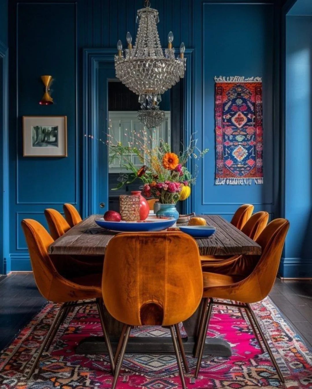
A saturated blue on paneled walls can hold its own against orange velvet chairs, and that pairing is the one I would copy. Blue and orange sit opposite each other, so each makes the other look richer.
Painting paneling is a weekend job: prime, then 2 coats, and the grooves take the longest. Pattern in the table wood and the rugs holds up against the deep color, and a crystal chandelier will catch the light well.
If orange feels like too much, rust or camel chairs still work.
4. Charcoal Dining Room Wall Color
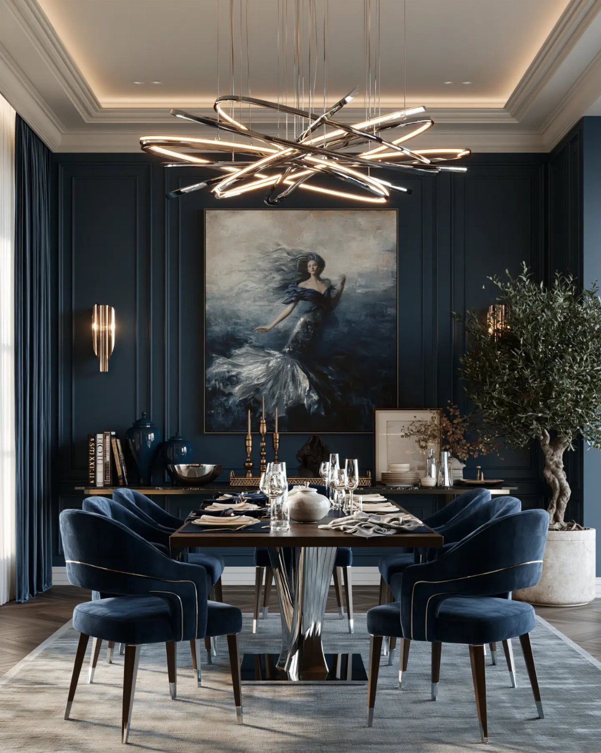
Charcoal is the dining room color I trust for evening dinners, when the walls fall back and the table lights up. Paneling, a large painting and a sculptural chandelier are enough, and extra objects would only crowd it.
Blue velvet chairs against dark gray add color without fighting the walls. A dark wood table works, but I would add a lighter rug so the space doesn’t sink into the color.
Go matte on the walls; glossy charcoal shows every roller mark.
5. Navy Dining Room Wall Color
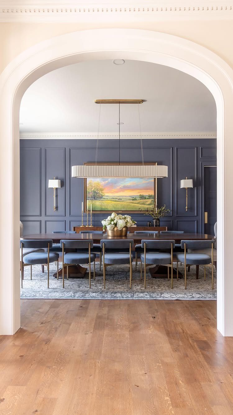
Navy on paneled walls makes a dining room feel like a place for long dinners. Paint the paneling and the wall above it the same navy so the room wraps around you instead of being cut into stripes.
I would keep the table dark wood and let the chairs stay in the blue family.
Expect two coats at least; navy looks patchy over one.
6. Deep Yellow
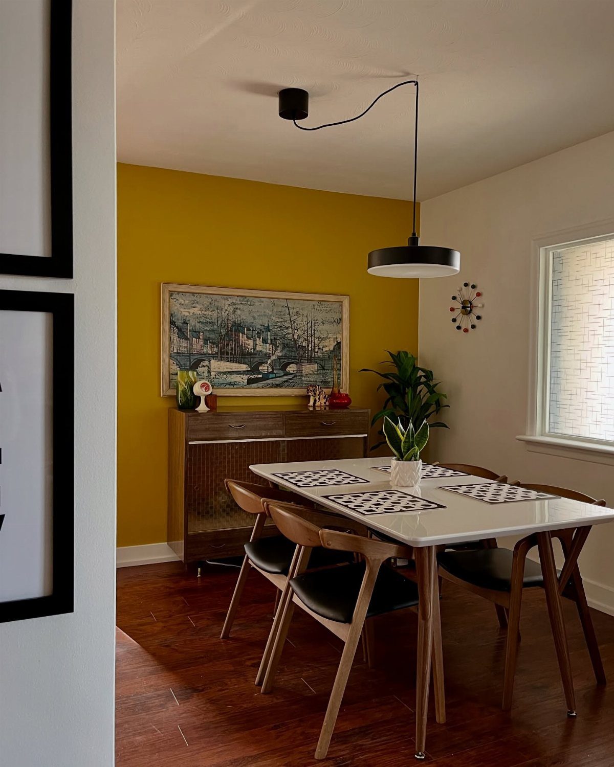
One deep yellow wall behind a sideboard turns a plain dining area into the sunniest corner of the house.
Painting just one wall also keeps the cost to a single gallon and an afternoon, which suits a renter or a first-time painter.
White and wood are the neutrals I reach for here, since they leave the yellow as the only loud thing in the room.
Pick a yellow with some depth, closer to mustard than lemon, so it feels warm instead of sharp.
Hang a large painting on it to anchor the wall.
7. Olive Green Dining Room Walls
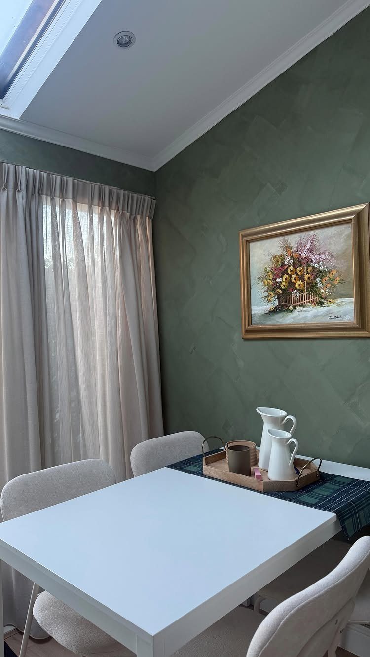
Olive green with a little texture in the wall finish reads as a grown-up color, and a white table and white chairs keep it from getting heavy.
Olive works as a backdrop, so floral art and a few white pitchers on a tray stand out against it without any extra effort.
I would pick a gray-leaning olive over a yellow one, so it stays calm. Paint a large sample board and look at it next to your white furniture before buying a gallon.
8. Classic Light Blue
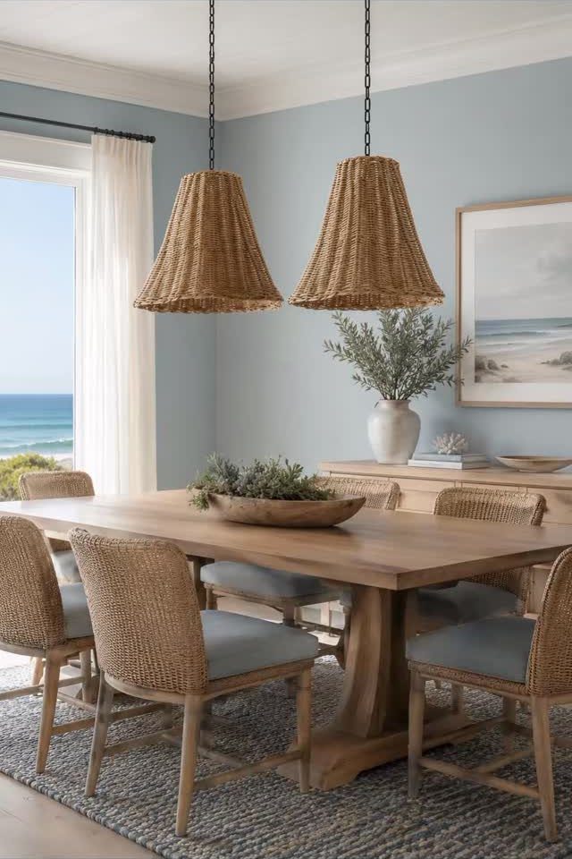
Light blue is the safest way to bring a seaside mood indoors, even without an ocean outside the window.
Choose a blue with a touch of gray so it reads as a color and not a nursery.
Test it beside your table wood, since warm wood and cool blue flatter each other.
9. Terracotta Brick Red Dining Room
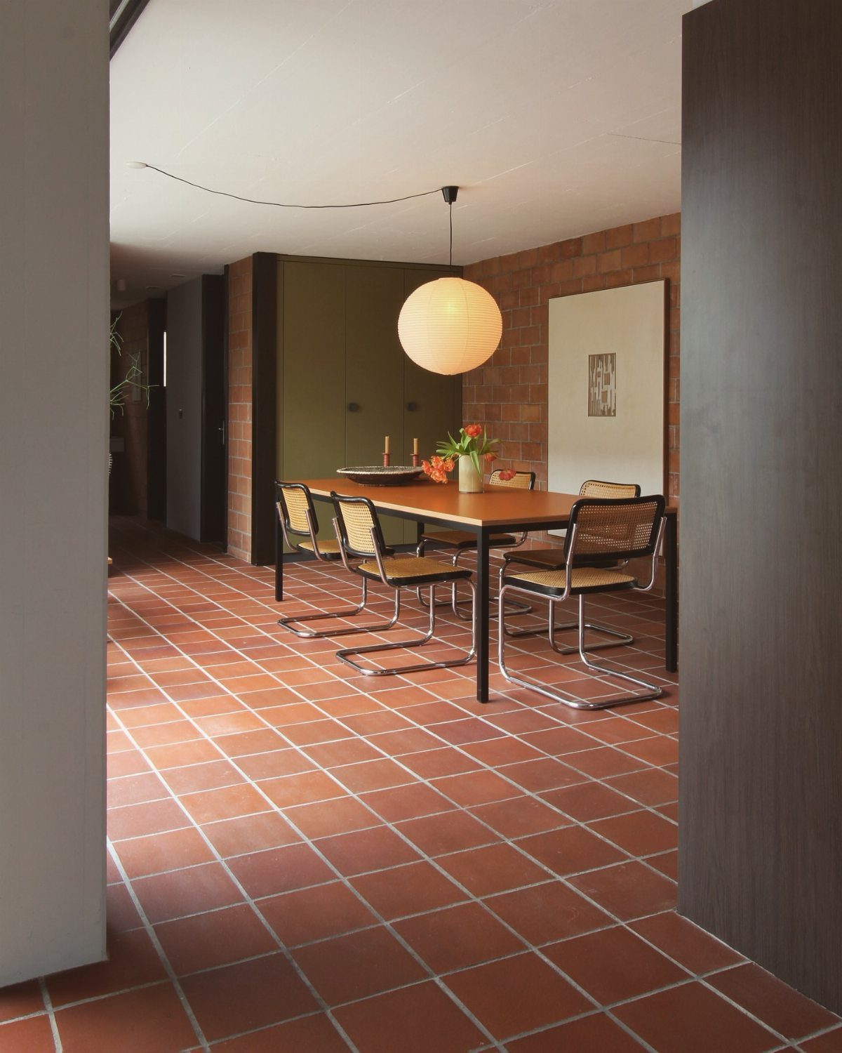
A terracotta brick wall and matching tile floor make a dining room feel baked in warmth, and the wooden table sits well inside it.
Paint is the budget route: a chalky terracotta or brick red, in the Tuscan Red family, gives the same impact on plain drywall for the cost of a gallon or two.
Keep the light fixture pale, like a white paper globe, so the red-orange has room to breathe. Choose a matte finish to keep the chalky look.
10. Muted Greens Dining Room Wall Color
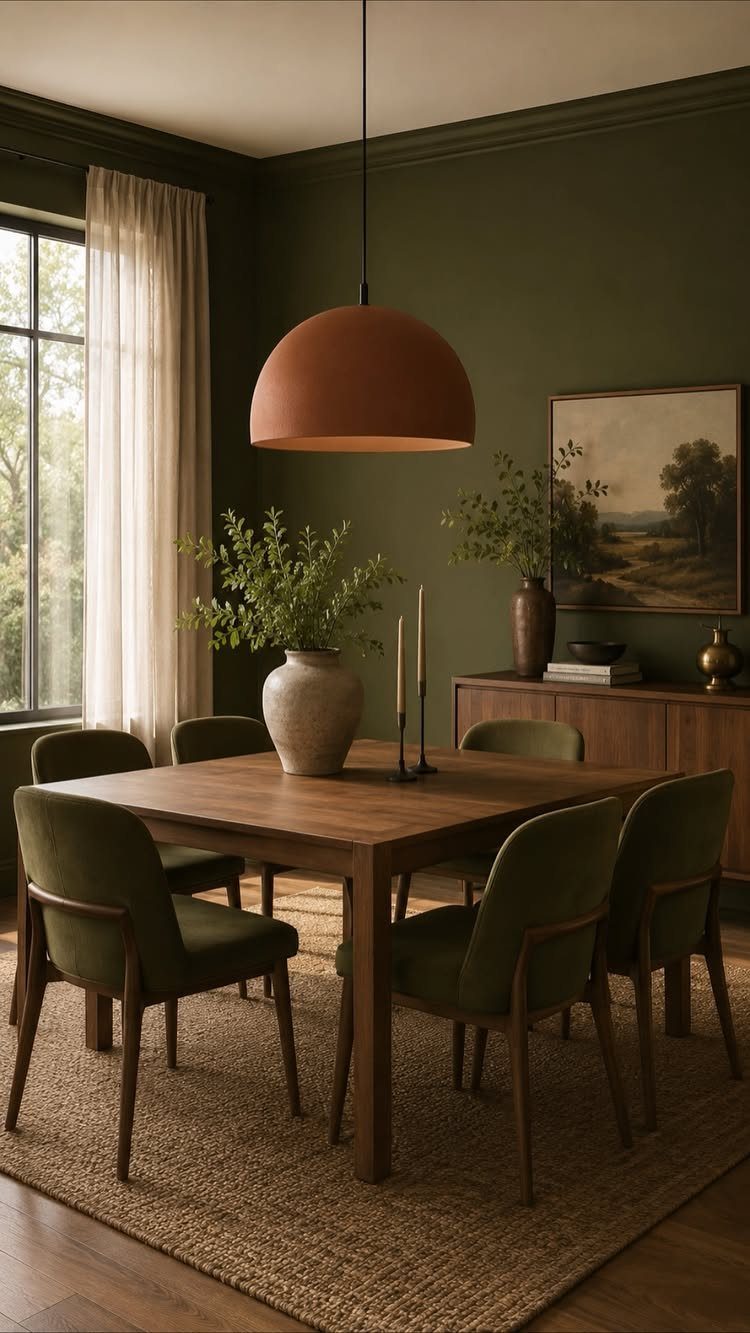
Muted green is the one I would paint first if you are unsure about color. Gray-toned greens pair well with wood, so a wooden table, a jute rug and a landscape painting all fit.
Velvet chairs in a green close to the wall add layers, and a terracotta pendant brings in a warm contrast. Go with a matte or eggshell finish, and check a sample at night, since green can turn darker under lamps.
11. Muted Taupe Dining Room Walls
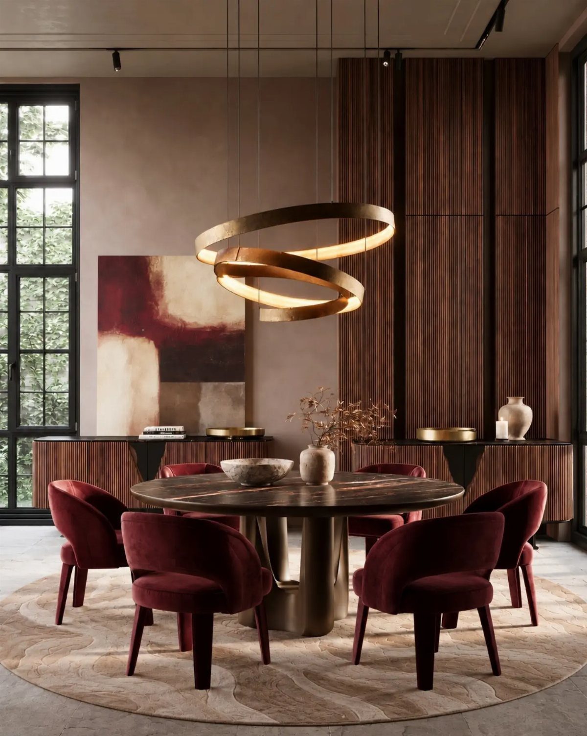
Taupe on the walls with vertical wood paneling gives a modern dining room a calm, tailored base. Deep red velvet chairs are the bold move, and they work because the taupe stays quiet around them.
I would keep the rest simple: a dark round table, one large abstract painting, and a gold pendant for warmth. Taupe can lean pink or green, so hold a sample against the paneling before you commit.
Bold, moody, and dark dining room paint colors like a luscious chocolate brown and deep high-gloss teal surprise and delight.
— Veranda
12. Dusty Rose Pink Walls
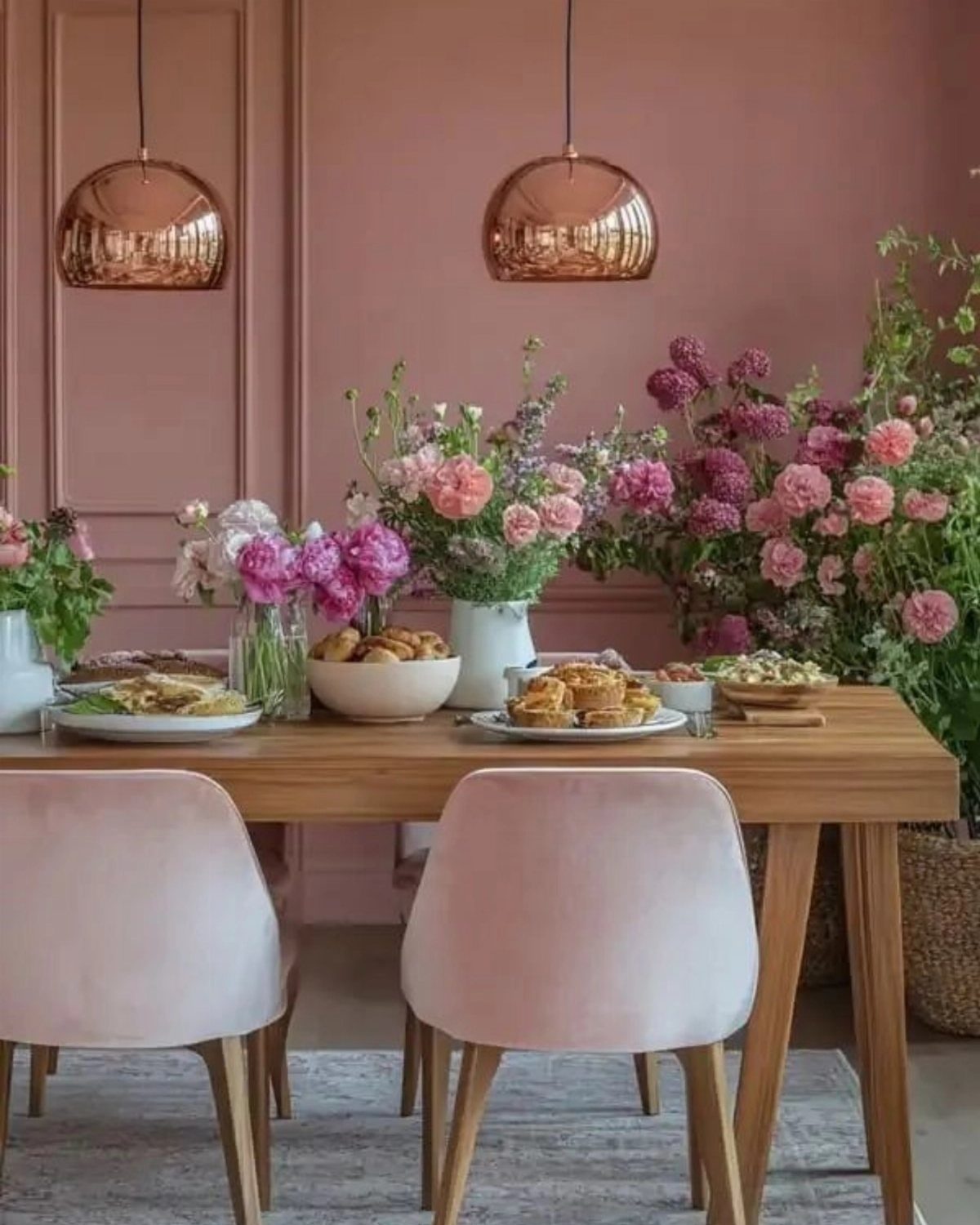
Dusty rose is pink with the sweetness taken out, and it suits a dining room better than most people expect. Pair it with a wooden table and copper pendants, since the metal’s warmth picks up the rosy tone.
Pink velvet chairs push it further, but I would only go tone-on-tone if the chairs are a shade deeper than the wall. Fresh flowers on the table finish the look without any extra cost beyond a bunch from the store.
13. Warm Beige Dining Room
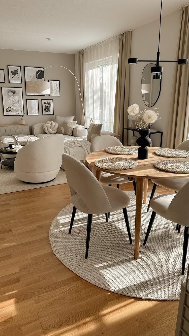
Warm beige walls let a round wooden table and beige chairs sit in the same quiet family, which is why this open-plan setup feels so calm.
Because the dining and lounge areas share one view, a single wall color ties them together.
I would pick a beige with a yellow-pink warmth over a gray one, so the wood looks rich instead of dull. A white rug keeps the floor light.
Test a sample where the living room light meets the dining corner.
14. Bold Color Accent Wall
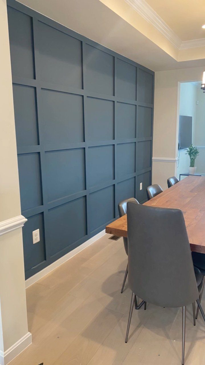
A navy wall with a grid of molding is a bold move that costs one wall’s worth of paint. The grid gives the color texture, so the wall reads as a feature and not just a dark patch.
Paint the molding and the wall inside it the same navy; contrasting trim would break up the grid.
Apply 2 coats, and tape the edges carefully where the navy meets the lighter walls.
15. Color Blocking Walls
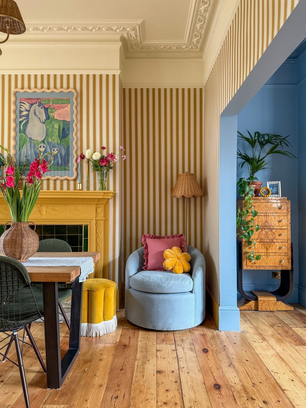
Color blocking works best when each color gets its own zone: here, striped beige-and-yellow walls in the main area and a blue wall set back in the alcove.
The alcove is the natural place for the deepest color, since its edges already frame it.
I would keep the furniture in the same palette. A blue armchair and a yellow ottoman repeat the wall colors, so the mix looks planned.
Tape the line where colors meet, and cap the palette at 3 colors so the wall reads as a plan, not a patchwork.
16. Complement Existing Furniture and Decor
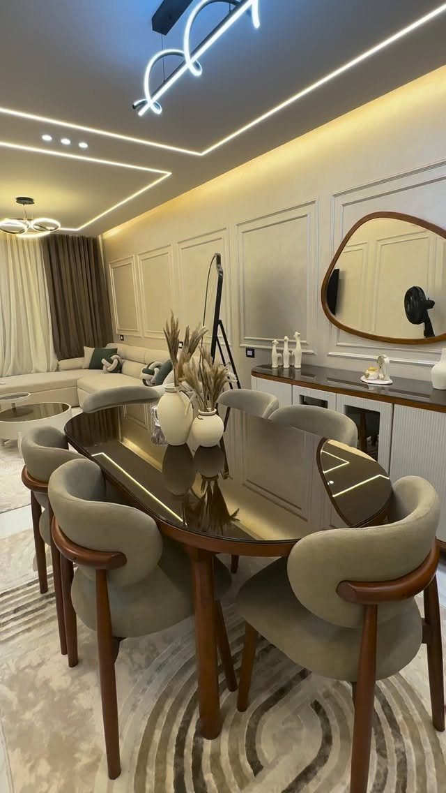
Start with the furniture and decor in the room now, and pick the wall color second.
Hold paint chips against your largest piece first, usually the table. If the wood is dark, a pale wall balances it; a large oval mirror then reflects that light back.
Buying paint is cheaper than replacing furniture, so let the furniture lead.
Color Psychology
Decide how you want people to feel at the table before you pick a chip. Color shapes mood, and a dining room is a place where mood matters, since it affects how long guests stay and how relaxed they are.
Warm tones like cream, pink, red and orange feel energetic and welcoming, and they are known for stimulating appetite. That makes them a good fit for a family dinner room or a host who wants people to linger.
Cool tones like soft blue calm a room down. Pale versions also make a small dining area feel open and quietly elegant, which helps in a tight space.
Deep shades such as navy or forest green add drama and intimacy, so an ordinary meal feels like an occasion.
Choose the feeling first, then the shade. A trendy color that works against the mood you want will bother you every night.
Frequently Asked Questions
What color is good for a dining room?
If you can only commit to one can of paint, make it a gray-green with a soft, dusty undertone; wood tables and jute rugs both sit comfortably against it.
Deep navy or charcoal suit evening dinners, and soft warm whites keep a room quiet.
Should the kitchen and dining room be the same color?
No, they don’t have to match. When one sightline runs from the kitchen into the dining area, carrying a single warm beige across both walls keeps the open plan from looking chopped up.
Otherwise, colors in the same family or with similar undertones give you flow while each room keeps its own character.