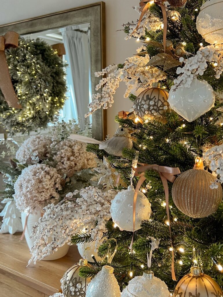
Which idea fits depends on where you are working: the tree, a mantel, the table, a countertop tray or a garland each asks for a different move.
Whatever you pick, the palette holds at 2 to 3 colors total, even if they are different shades of one color, and texture does the rest.
1. Wood Beads Garlands

Light wood beads read as texture more than color, which is why they work on a flocked tree: they add warmth without breaking a white-and-cream palette.
Drape the garland loosely and let it dip between branches rather than pulling it tight. Start at the top and work down in even swags, so the spacing stays consistent from one side of the tree to the other.
I prefer a single strand weight throughout. Mixing thick and thin beads looks busy on a tree that is meant to be calm.
2. Neutral Ribbons

A long tan ribbon on a green wreath is the cheapest finishing move in a neutral scheme, since the wreath does the color work and the ribbon softens it.
Let the tails hang long instead of tying a short bow. The length gives the front door a relaxed look, and it moves nicely when someone walks past.
Pick a ribbon in a muted tan or oatmeal rather than bright white, which can look stark against evergreen. Buy more than you think you need; a short ribbon is the one mistake you can’t fix.
3. Keep It Minimal
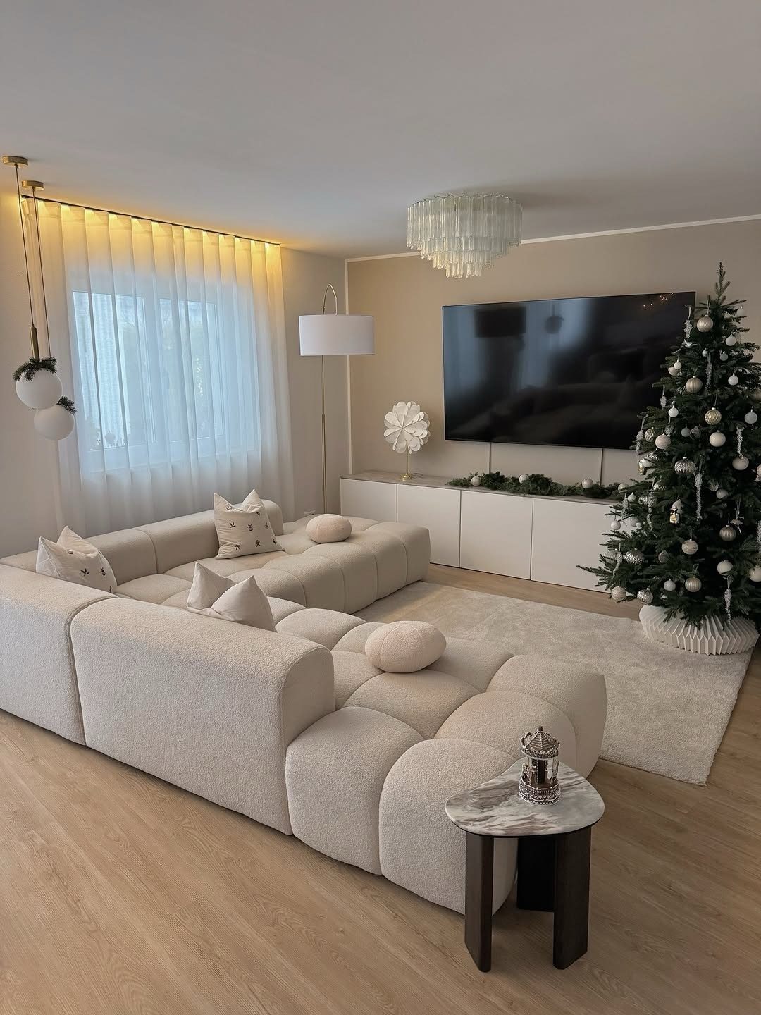
Restraint does the heavy lifting in a room with cream furniture and a white entertainment center: one tree, one color family, and plenty of empty surface around it.
White and silver ornaments only, spaced so you can see branch between them. If you want one more layer, I’d add it to the tree before adding it to the shelves.
Clear space is part of the design here. When a surface looks bare, resist filling it.
4. Pinecones and Birch Branches
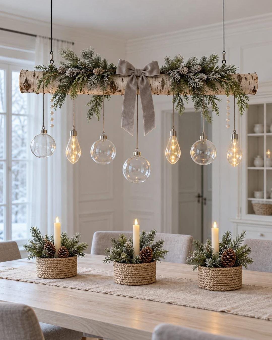
Pinecones and evergreen sprigs repeated down the length of a table make a centerpiece set feel planned, especially with candles tucked among them.
Make three matching arrangements instead of one large piece. Matching small groups let you space them evenly and keep sight lines open across the table, so people can still talk over dinner.
Birch is the other natural material worth adding, and a few branches go a long way. Keep the palette to green, brown and warm light so the table stays quiet.
5. Our Christmas Tree
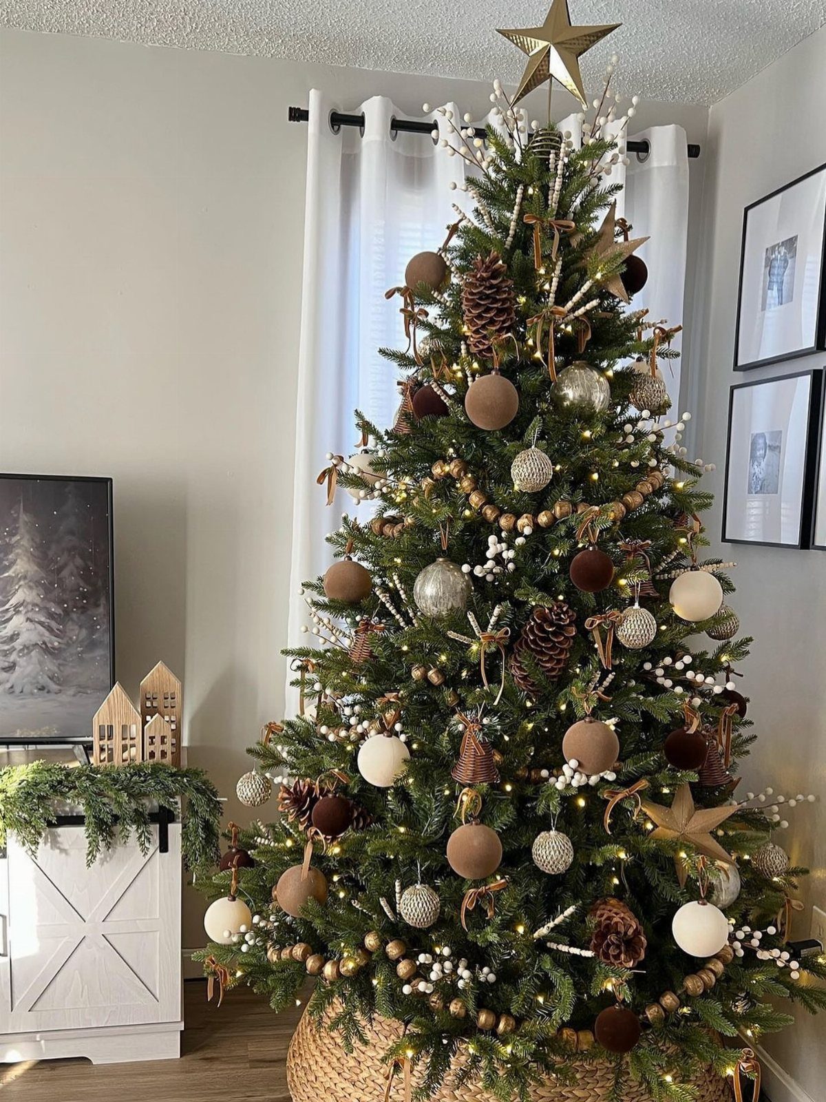
Gold gets easier to use when everything around it is earthy: pinecones and wood beads on the branches, and a simple gold star at the top.
I like keeping the ornaments to two or three tones, all muted, so the star is the only shiny thing. A white cabinet and white curtains nearby help, because a bright room keeps natural materials from looking heavy.
Pinecones are a low-cost way to fill gaps. Tuck them deeper into the branches for depth.
6. Cozy Corners
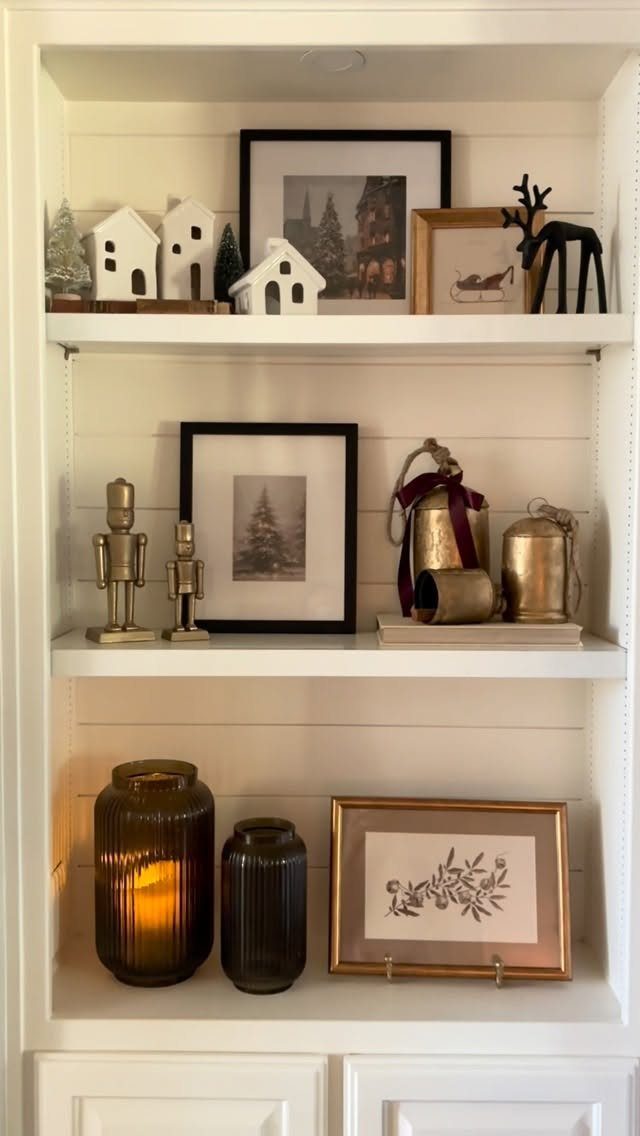
Built-in shelves are a ready-made stage for a small holiday scene, and 3 tiers give you room to vary height without crowding.
Group items in odd numbers and mix materials: gold bells beside ceramic or glass, small houses next to framed art. Keep a little empty space on each shelf so every piece reads.
Add a few candles for glow, and keep the colors to white, gold and brown. Stepping back after each tier shows quickly when something is one piece too many.
7. Neutral Table Settings
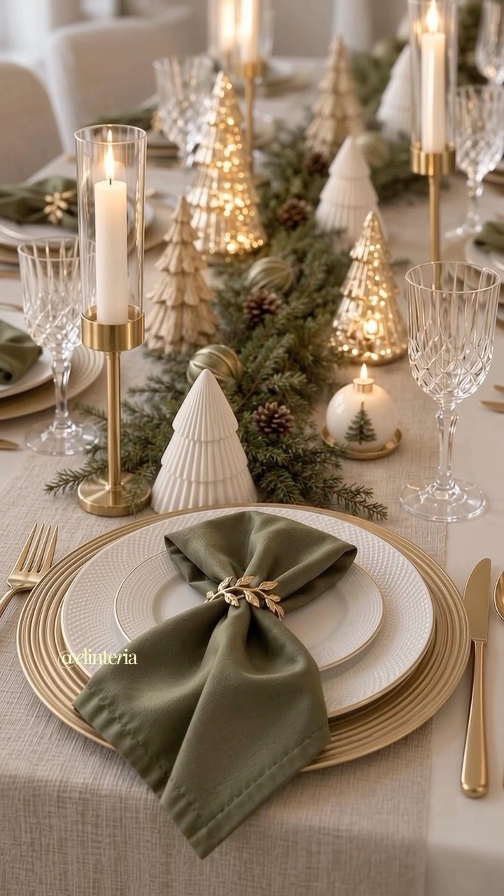
Run the garland down the middle and nestle the trees at uneven intervals, leaving gaps so the pattern doesn’t look measured. Gold chargers under white plates carry the metallic through to each seat.
Olive napkins are my pick over bright green, since the muted tone sits comfortably beside cream plates and brass flatware. They stay muted next to the gold and let the neutral plates do the talking.
8. Gold and Neutral Countertop Tray
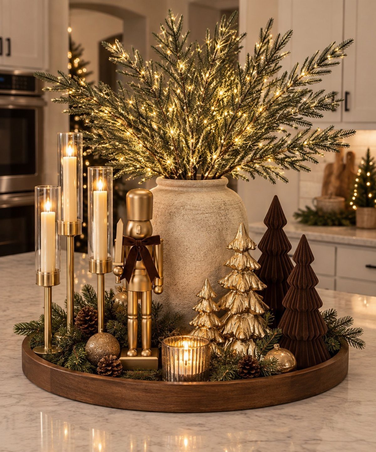
A wooden tray gives a countertop display edges, and edges are what make a handful of small pieces look like one arrangement instead of clutter.
Pair gold candle holders and a nutcracker with a few bottle brush trees, then add height with lit pine branches in a neutral vase. Vary the heights, and keep the trees in gold and brown so the group stays calm.
Marble is a cool surface, so the warm wood underneath helps. Fill the tray, but leave some wood showing.
9. Hanging Neutral Baubles
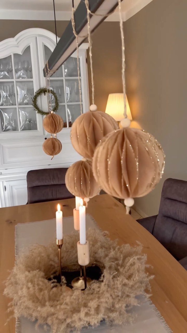
Fabric spheres in beige stripes, hung at different lengths from an overhead beam, bring the decorating up to eye level without using a single inch of table space.
Cut the strings so the baubles drop at staggered heights, and keep them high enough that nobody ducks while passing the dish. Fabric in a striped pattern adds texture, so you can skip color entirely.
If you have no beam, a curtain rod or a wire strung between 2 hooks does the same job. Hang them over a table that already has a wreath or candles, and stop there.
10. Neutral Mantels with Pine Garlands
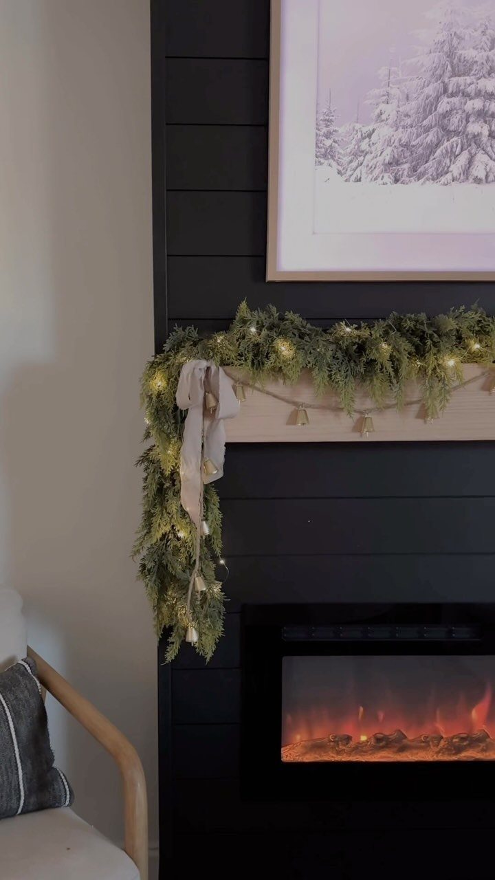
A pine garland with built-in lights does 2 jobs on a mantel: it supplies the green and the glow, so little else is needed.
Lay it along the full length and let the ends hang down each side. Finish with one neutral bow, because a single bow looks intentional where several look fussy.
I like this most on a mantel with a painting above it. Leave that space clear, and the garland frames the art instead of competing with it.
Long-term Decor Investment
Buy decor that can stay out past December. A gold candle or a simple garland works in a fall mantel and carries through winter, so you spend once and store less.
Ornaments in champagne tones come in matte, shiny and glittery finishes, and mixing those finishes adds depth without adding color. Shatter-resistant ones are the practical pick if kids or pets share your space.
Small off-white trees suit a climate with no snow, since they bring the winter look without needing it outside. A paper tree is light, cheap to store, and easy to slide onto a bookshelf.
I’d pick pieces by asking whether they still look right in January. If the answer is no, skip them.
Neutral Color Symbolism
Neutral tones read as calm, and that is why they suit a season that can get loud. Creamy whites, soft taupes, natural woods and a little metallic shine give you a winter look without visual overload.
The style leans Scandinavian: minimal, pale and quiet. It tends to bring a feeling of serenity and hope into a room.
Calm only holds if the palette stays tight. Choose a few tones, let texture do the work, and let the room breathe.
"The elegance of neutral-toned Christmas decor brings a sense of understated luxury," says Jamie Young, the founder of Jamie Young Co. "It’s incredibly versatile and can seamlessly blend with your existing furniture and décor easier than bolder Christmas colors."
Avoiding Traditional Colors
Skipping red and green doesn’t mean skipping color. Neutral here covers whites, beiges and golds, and the rule I trust is two to three colors total, even if they’re different shades of one color.
Trade a loud red vase for one in brushed gold, and the table keeps its holiday feel without the candy-cane color. Gold still feels festive, and it moves into the next season’s decor without a fight.
For something less expected, try blush pink, soft green, winter white and a few pops of gold together. It looks fresh and still reads as Christmas.
On a tree, lean on white and brown shades with ornaments made of wood and metal.
Frequently Asked Questions
What color ornaments look best on a Christmas tree?
Muted neutrals that match the room look best: white, cream, champagne, or wood and metal pieces in brown and gold.
Two or three tones is plenty. On a tree meant to feel calm, keeping the finish range wide (matte, shiny, glittery) adds depth without adding color.
What are neutral holiday colors?
In my book, a neutral Christmas palette starts with creamy white and warm beige, and soft gold joins them as the one metal that glows.
Natural woods and soft taupes fit too, and a little metallic shine keeps the look festive.
What are some neutral colors that are good for home decor?
Creamy whites, soft taupes, beiges, natural wood tones and gold are the easiest to live with.
They stay calm in a room and carry past the holidays. Keep the palette tight and let texture, like wood beads or fabric, supply the interest.
Which color is not traditional for Christmas?
Blush pink and sage green both step outside the classic red and green, and so does a pale winter white paired with gold.
Gold still feels festive, and a muted tan or oatmeal ribbon works well on an evergreen wreath. A brushed gold vase in place of a bright red one keeps the room feeling like the holidays, minus the candy-cane punch.