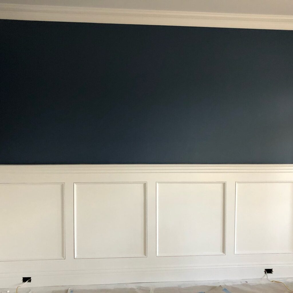
The ideas here run from an all-white trim job that works through shadow alone to scenic wallpaper above a plain painted lower wall, so the effort and cost swing with how much of the wall you cover.
Your starting wall decides it: a plain, scuffed wall wants wainscoting or beadboard below the rail, while a wall that already carries pattern or color, like floral wallpaper above, wants the rail to mark where it stops.
1. Wainscoting Below the Chair Rail
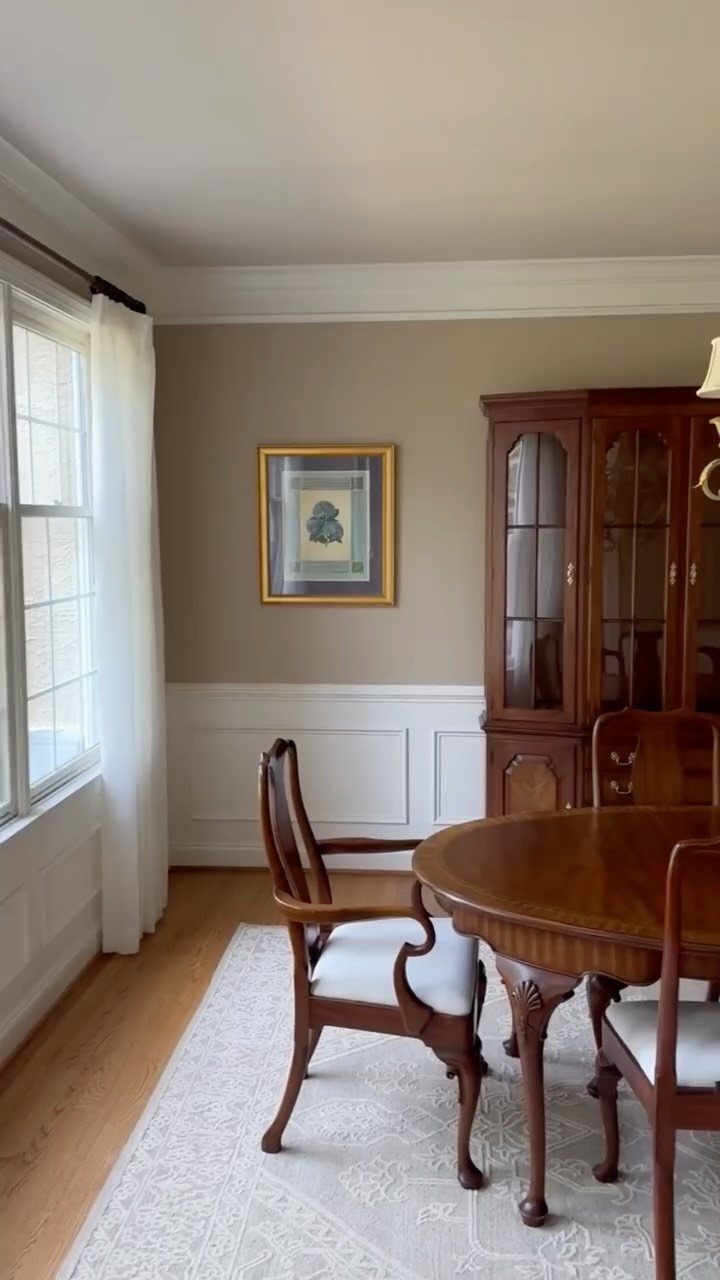
Wainscoting below the chair rail earns its place in a dining room because chairs bump and scrape that part of the wall all day. A hard paneled surface takes those hits, and a painted drywall surface does not.
White against beige walls keeps the room warm and gives the wood furniture a clean backdrop. I would pick semi-gloss or satin paint for the lower section so scuffs wipe off.
Keep the chair rail at a height that lines up with the chair backs.
2. Crisp White Beadboard
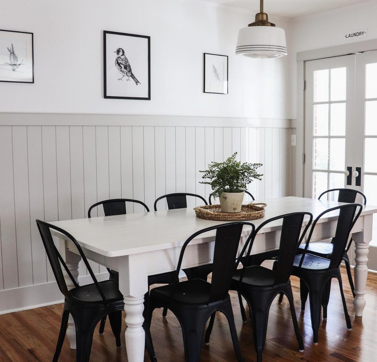
Beadboard is the easiest way to get a coastal feel in a dining room. The narrow vertical grooves add texture without adding color, so the room stays bright.
Paint it white, caulk the seams, and cap it with a chair rail for a finished edge. Beadboard also comes in sheet panels, which is a good fit for a weekend job on a small budget.
Black chairs and simple framed prints keep the look crisp rather than cute.
3. Picture Frame Molding Below Chair Rail
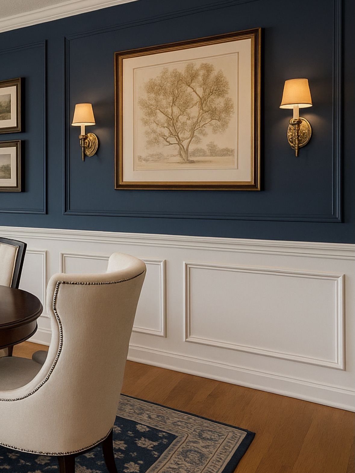
Picture frame molding breaks a plain lower wall into rectangles of shadow and light, and it’s the most formal look you can give a dining room.
Thin strips of trim, set in even boxes below the chair rail, do all the work.
Paint the boxes and the wall the same white so the shapes show through shadow alone. A dark upper wall like navy sharpens the contrast.
Measure and space the boxes evenly first; uneven gaps are the mistake people notice.
4. Tone on Tone Gray Shade
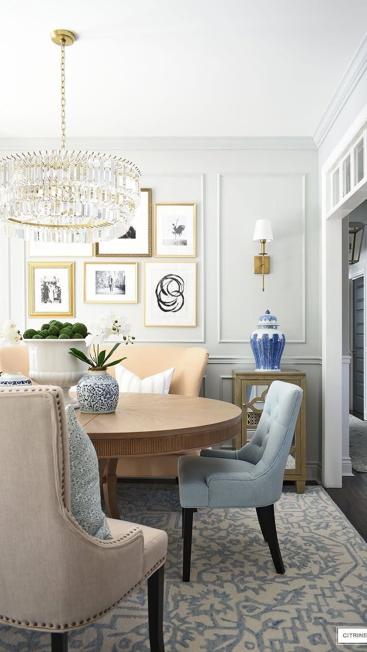
When the wall, chair rail and molding all get the same gray, the trim stops reading as contrast and shows up as shape, with only shadow to define it. The room feels calm and wrapped, and the details stay quiet.
This is a forgiving option for anyone nervous about picking 2 colors. Use a flat or matte finish on the wall and a satin finish on the trim if you want the molding to catch a little light.
Furniture, rugs and art then supply the color, so keep them lively.
5. Floral Wallpaper Above Chair Rail
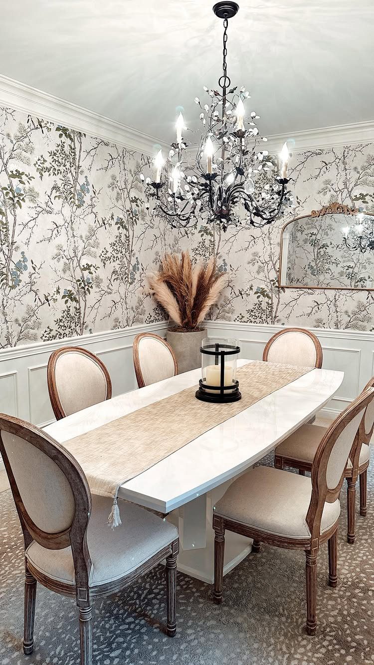
Floral wallpaper above a chair rail lets you use a bold pattern without covering every inch of the room. The rail marks where the print stops, and a white lower wall rests the eye.
Papering only the upper half also means fewer rolls to buy, which helps the budget. Peel-and-stick is a sensible pick for renters.
I would choose a botanical print with open space between the blooms, so a mirror and a chandelier can sit against it without a fight.
6. Natural Wood Chair Rail
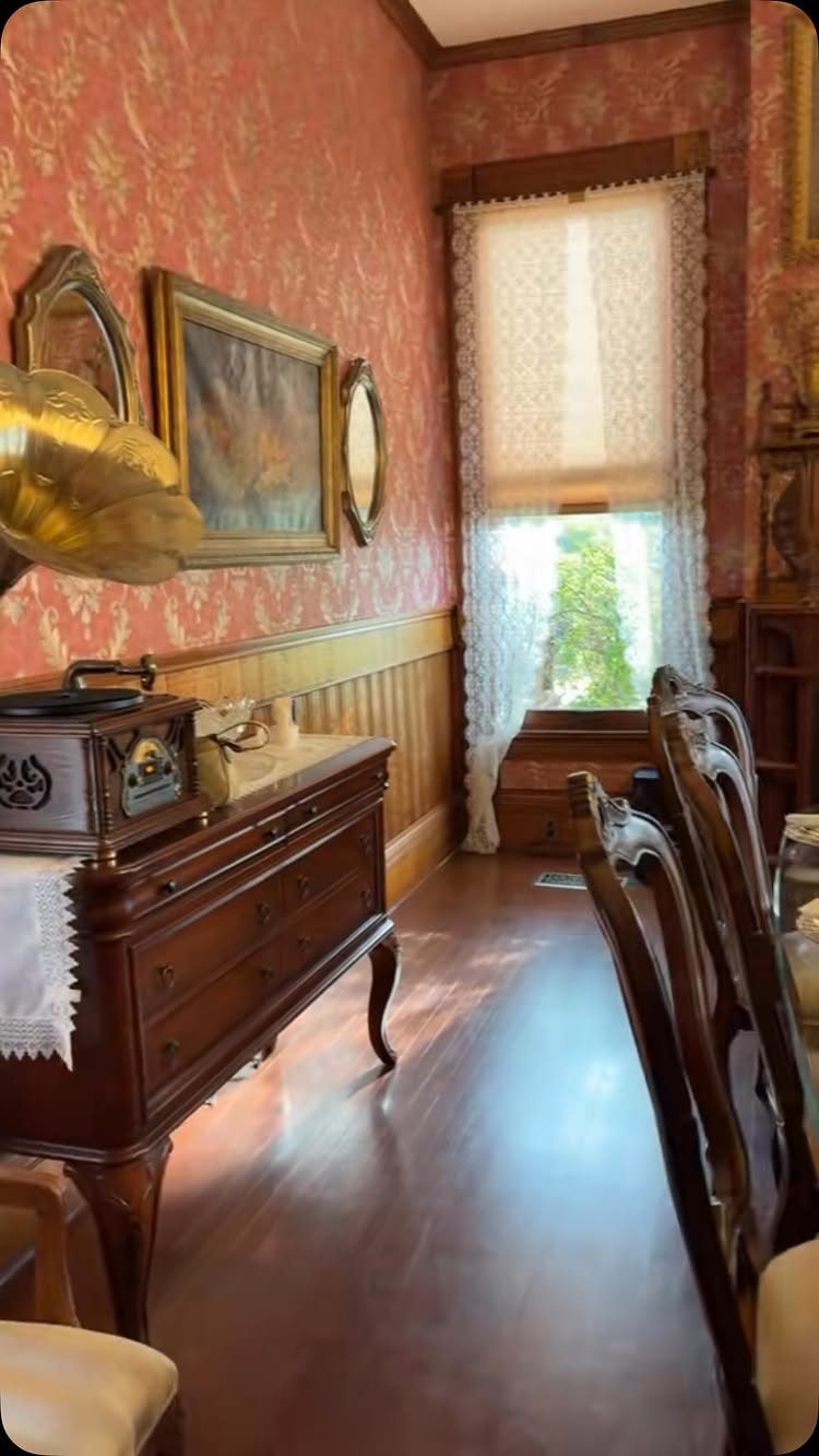
A chair rail in natural wood brings warmth and age to a patterned wallpaper. The wood grain acts as a frame, giving a busy print a clear edge and a place to stop.
Match the rail to the wood already in the room, like the sideboard and chairs, so it looks planned. Stain or clear finish keeps the grain visible; paint would lose the effect.
Red patterned paper above and a quieter lower wall keeps the look vintage without getting heavy.
7. Two-Tone Painted Wall Division
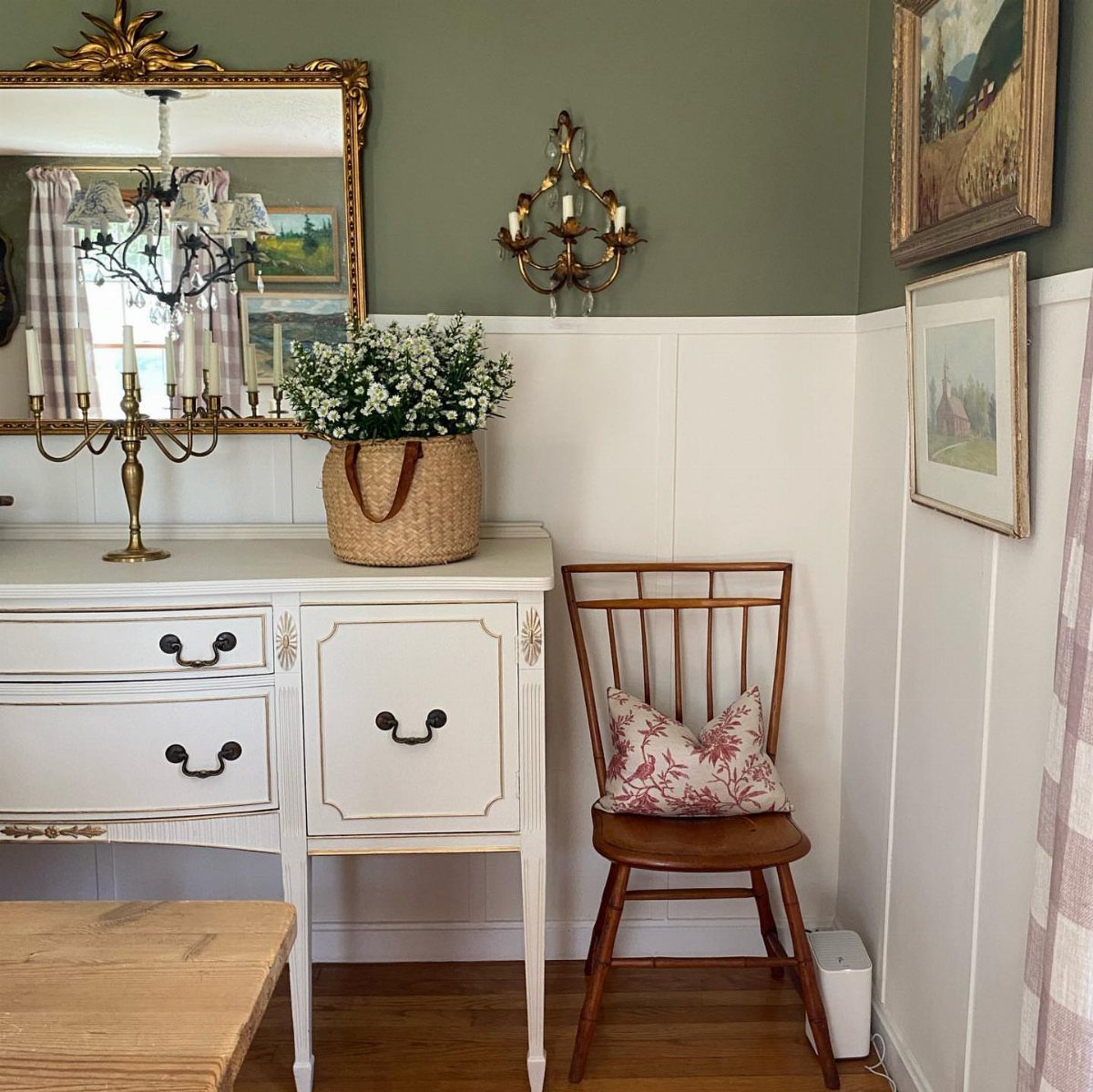
Olive green above and white below turns the chair rail into a clean dividing line, and the rail itself needs no color of its own. Painting it white keeps it tied to the lower wall.
Use painter’s tape along the top edge of the rail and press it down firmly before the green goes on. Paint the green first, then the white, so any slip is easy to touch up.
White furniture and a mirror sit well against the olive.
8. Scenic Landscape Wallpaper Above Chair Rail
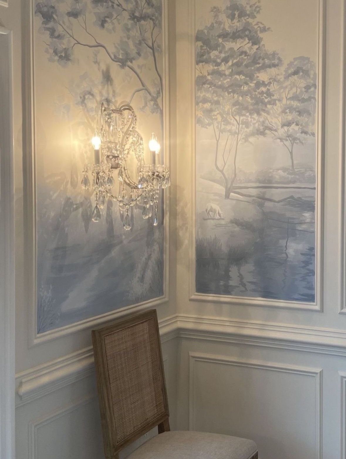
A scenic mural gives a dining room a view, and the chair rail keeps it from running to the floor.
Wainscoting below the rail holds the lower wall quietly, so a scenic wallpaper above it gets the eye, and I’d keep that lower section in a solid paint color so the two don’t compete.
Choose a mural in soft, cool colors if you want the room to feel calm. Peel-and-stick panels are a reasonable pick for renters, and covering only the upper half costs less than a full wall.
A white chair rail gives the scenic paper a crisp edge to end on.
9. Monochromatic Deep Red Dining Room
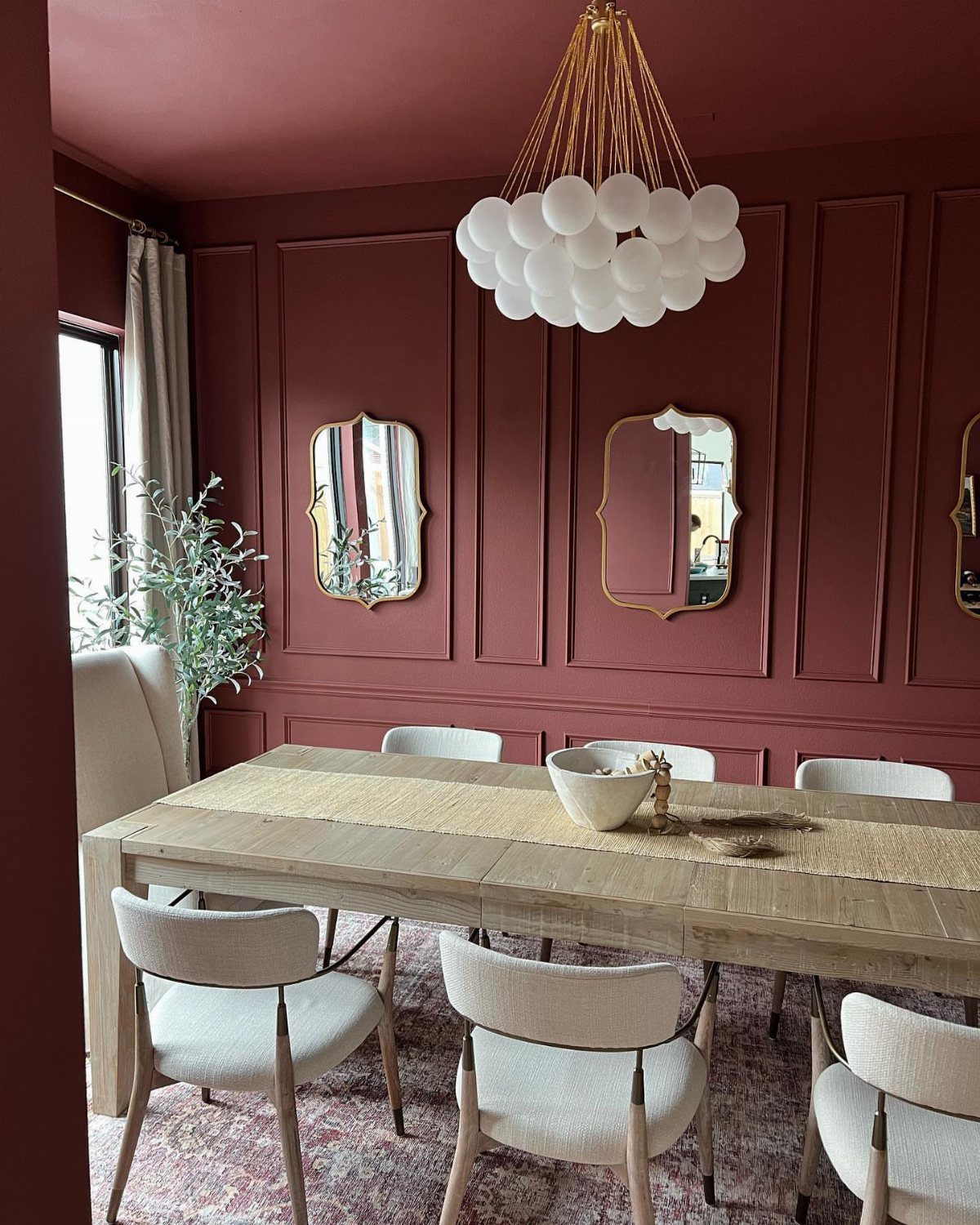
Painting everything red, from the upper wall to the molding below the rail, makes a dining room feel like a single deep color rather than a set of parts. The picture frame molding still reads through shadow.
I would use a satin or eggshell finish so the red keeps some depth and the lower wall wipes clean. Light wood and white chairs, plus gold frames, keep it from feeling heavy.
Test a large swatch first, since deep reds shift a lot with the light.
10. Upper and Lower Rectangular Wall Panels
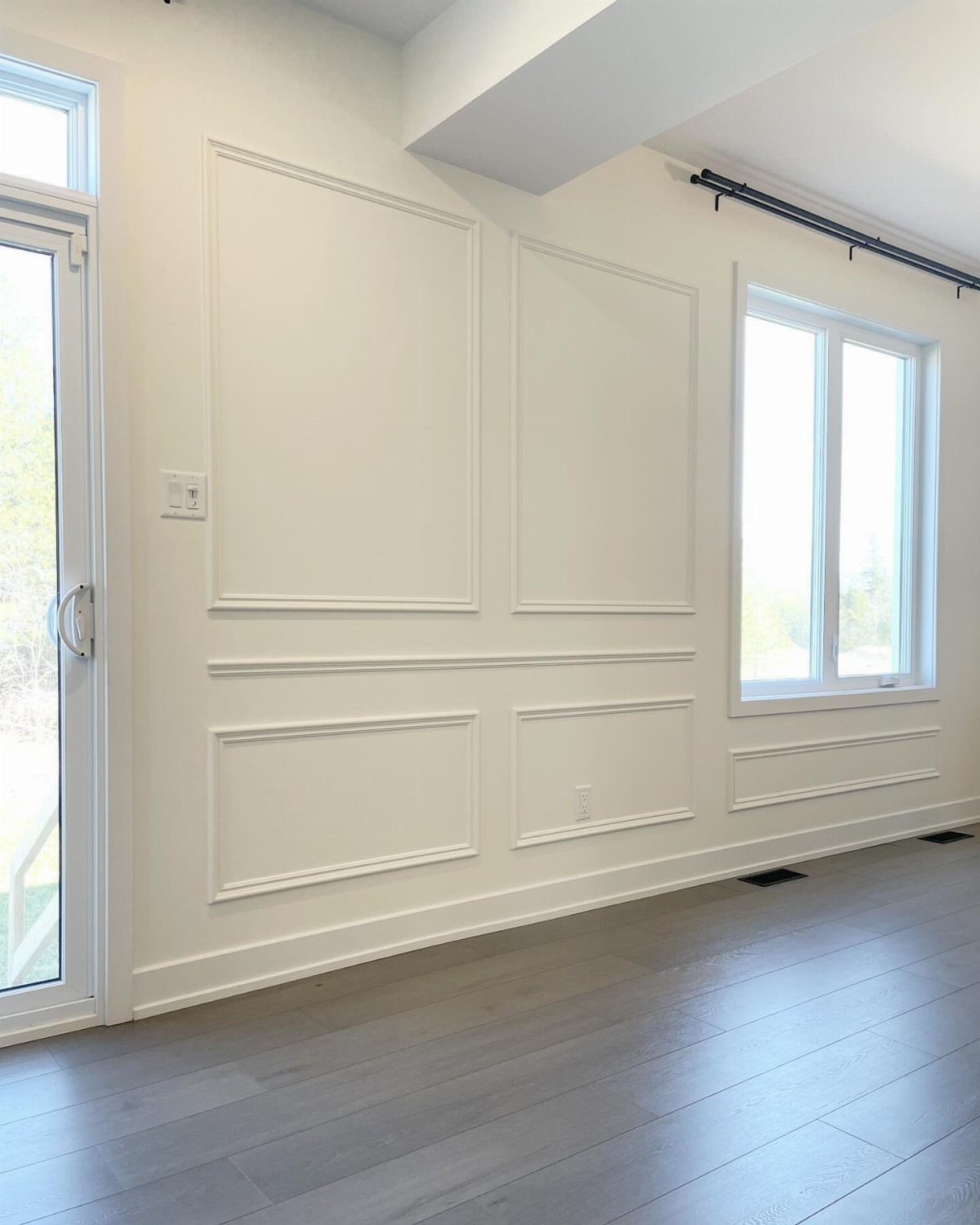
Matching rectangles above and below the chair rail give a wall a steady, even rhythm.
Mark every box on the wall with a level and tape before you glue or nail anything. Keep the gaps and box sizes identical top and bottom, working around the window and door.
Painting it all one white keeps the effect in the shadows.
11. All-White Walls and Chair Rail
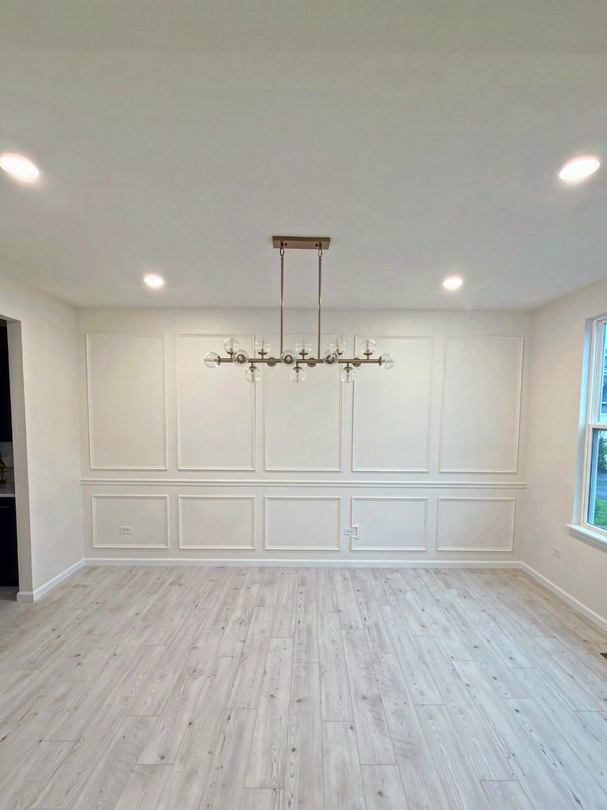
White paint carried across the upper wall, the rail and the lower panels makes the trim a matter of shadow and nothing else. It is the quietest way to dress a dining room with molding.
Use one white throughout so the pieces do not drift apart. Satin on the trim and panels helps it hold up and wipe clean, and a flat or matte finish on the upper wall hides flaws.
A bold chandelier then has the room to itself.
Chair Rail History and Purpose
Chair rails started as wall armor. Dining chairs get pulled back from the table again and again, and the rail took the hits that would otherwise dent or scuff the plaster.
The Shakers went a step further and fitted rails with pegs, so chairs could hang off the wall and make sweeping the floor easier.
Today most rails are decorative. A rail also breaks up a big, plain wall, which is useful in a room with a lot of surface to fill.
If you like old-house character, a rail is one of the cheapest ways to get it. It still does its first job, too, and your walls will thank you at the next big dinner.
Modern Uses of Chair Rails
A chair rail can look current if you stop treating it as a dividing line.
Match the rail to the wall color and it nearly disappears; paint the rail and wall in the same bold, saturated shade and it reads as a choice, and a current one.
Designers also suggest keeping the upper wall, rail and lower paneling in similar hues. For an airy room, keep the whole wall in light neutrals, and for a moodier one, take every part of it dark.
A dark, contrasting paint color below the chair rail suits a formal dining room, but it makes the division between the wall’s upper and lower halves loud.
The modern approach plays the rail down and uses it for layering, depth and texture instead of a hard break across the wall.
Chair railing is still in style! Trim molding is seeing a major resurgence today.
Chair Rail Placement Tips
Most chair rails sit 30–36 inches off the floor. Older homes sometimes go lower, because the proportions of the room call for it.
Before you mark anything, measure your dining chair backs. Any box molding or paneling under the rail needs to stay below the top of the chair backs, so the chairs never bump into it.
A growing number of carpenters skip chair height as the starting point and set the rail by classical proportion instead. I’d treat the chair measurement as a check and let the room’s proportions lead.
Rails often divide a wall into thirds, so tape a strip at your chosen height and step back to see how the wall splits before you fasten anything.
Frequently Asked Questions
Is chair rail still in style?
Yes. Trim molding is having a comeback, and a chair rail looks current when you handle it with some care.
Matching the rail to the wall color, or keeping the upper wall, rail and lower paneling close in tone, softens the line so the rail looks chosen instead of cutting the wall in two.
What can I use instead of a chair rail?
A change in paint color can create the same break in the wall, so a rail is optional.
Paneling or wainscoting adds millwork and a more formal feel, shadow boxes work too, and wallpaper brings pattern if you want more personality.
A grasscloth-style paper woven from natural fibers is the quieter route when a bold print feels like too much, since it brings texture without a pattern.
What is the difference between wainscoting and a chair rail?
Wainscoting is wall paneling that covers the lower part of the wall, and it can be very elaborate or very simple, with beadboard being the common version.
A chair rail is a single horizontal strip of molding set at about the height of a dining chair back.
Rails first protected plaster from chairs knocking into it, and they often sit right on top of wainscoting as its cap.
What color should I paint a dining room with a chair rail?
For the easiest result, paint the wall, rail and molding one color, such as a single white or a single gray, so the trim shows up as shadow instead of contrast.